7.0.0 release highlights
edit7.0.0 release highlights
editEach release of Kibana brings new features and product improvements. Here are the highlights of the feature and user experience changes in 7.0.0.
Refer to the Kibana breaking changes and release notes for a list of bug fixes and other changes.
Fresh, sleek design
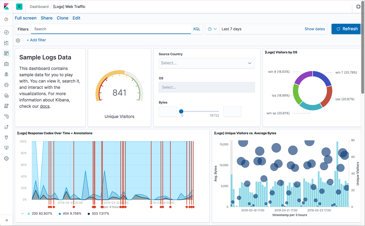
editSince the introduction of the Elastic UI framework in 6.2, Kibana has undergone a major design revamp. This release showcases a lighter, more minimal design that brings it all together. The biggest change is a persistent global header, which displays information related to where you are in Kibana. The side navigation is now collapsed by default, giving applications more horizontal space. Dashboards and most of the Kibana applications also got much needed touch-ups. Finally, the font changed to Inter UI, which is closer to more modern system fonts found on your OS of choice.
Kibana Query Language on by default
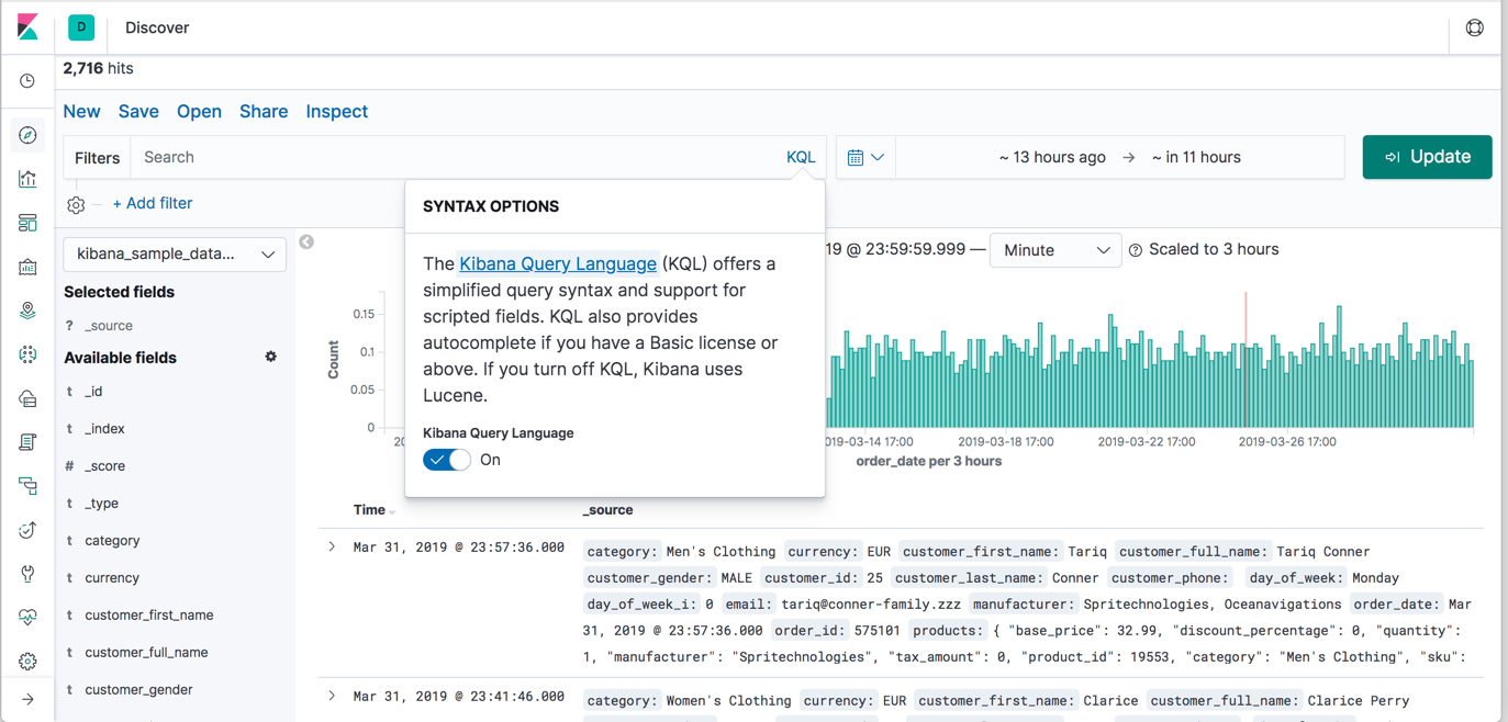
editIn 6.3, Kibana introduced the Kibana Query Language (KQL), and in 7.0.0, KQL is the default. KQL offers a simplified query syntax and support for scripted fields. If you have a Basic license (the default distribution) or above, KQL also provides autocomplete. If you prefer the Lucene query syntax, you have the option to turn off KQL.
Kibana dark theme
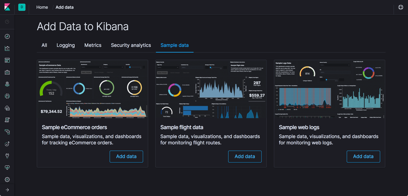
editKibana now supports a dark theme across the entire application. To try out this theme, go to Management > Advanced settings, flip the dark mode switch, and reload your page. Because theme selection is saved at the Spaces level, you can no longer set a dark or light theme on an individual dashboard.
Responsive dashboards
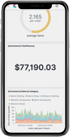
edit[preview] This functionality is in technical preview and may be changed or removed in a future release. Elastic will work to fix any issues, but features in technical preview are not subject to the support SLA of official GA features. As part of the enhancements to Kibana dashboards in 7.0, the design is more responsive. If you want to view and interact with Kibana on the go, pull it up on your phone and test out this new, experimental responsive layout.
New look for timepicker and filters
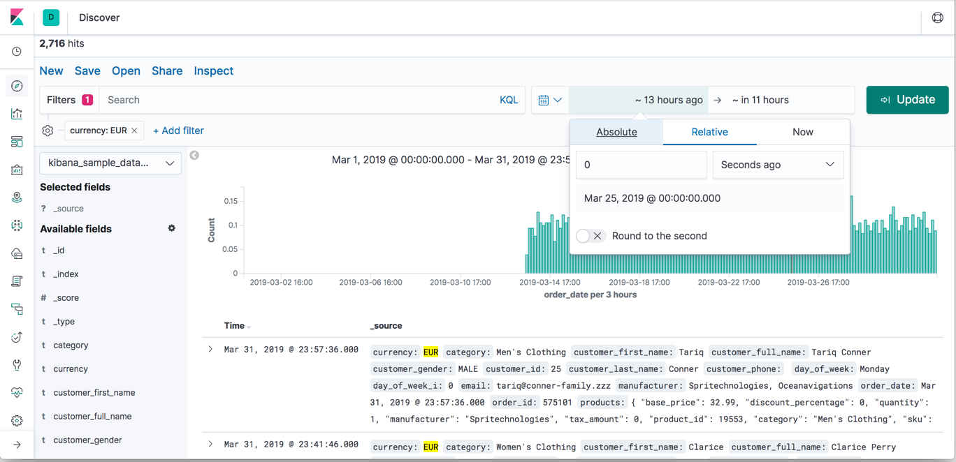
editThe timepicker now makes it easier to deal with complex date queries. For example, you can mix relative times with absolute ones. The timepicker design is also improved. The control no longer pushes the content down the page as you interact with it. The design is also more compact, which is necessary to make it work better on mobile dashboards.
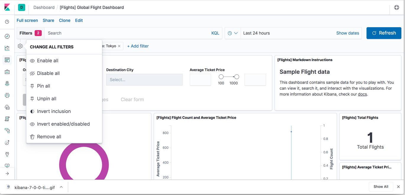
Filters are enhanced in two ways. Each filter now provides a dropdown menu that clearly defines the actions you can take on the filter. There’s also a new menu for dealing with filters in bulk.
Saved objects structure improvements
editThe structure of saved objects changed, so that they are now aware of each other. This means you can now export a dashboard, including all visualization dependencies, from the Saved objects page. You can also easily move objects from one Kibana instance to another or between Spaces.
Canvas enhancements
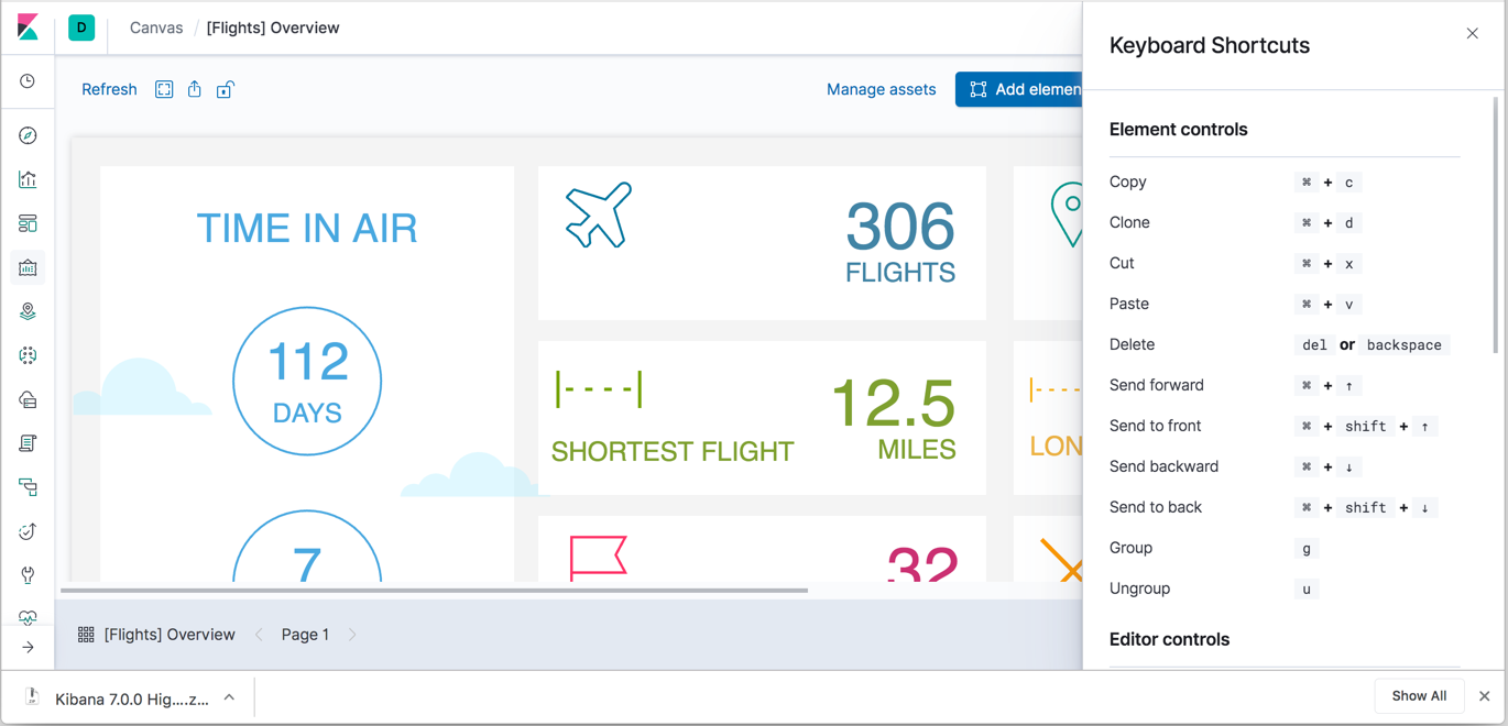
editCanvas has two notable improvements: an expandable expression editor and additional keyboard shortcuts.
To maximize or minimize the expression editor,
use the expand button  in the top right corner of the editor. To adjust the font size, use the slider
at the bottom.
Canvas has more keyboard shortcuts for moving elements to the front and back and for copying your elements. To discover all shortcuts available in Canvas, click the help icon.
