Mapping anomalies by location
editMapping anomalies by location
editIf your data includes vector layers that are defined in the Elastic Maps Service (EMS), your anomaly detection jobs can generate a map of the anomalies by location.
Prerequisites
editIf you want to view choropleth maps in Data Visualizer or anomaly detection job results, you must have fields that contain valid vector layers (such as country codes or postal codes).
This example uses the sample web logs data set. For more information, see Add the sample data.
Explore your data
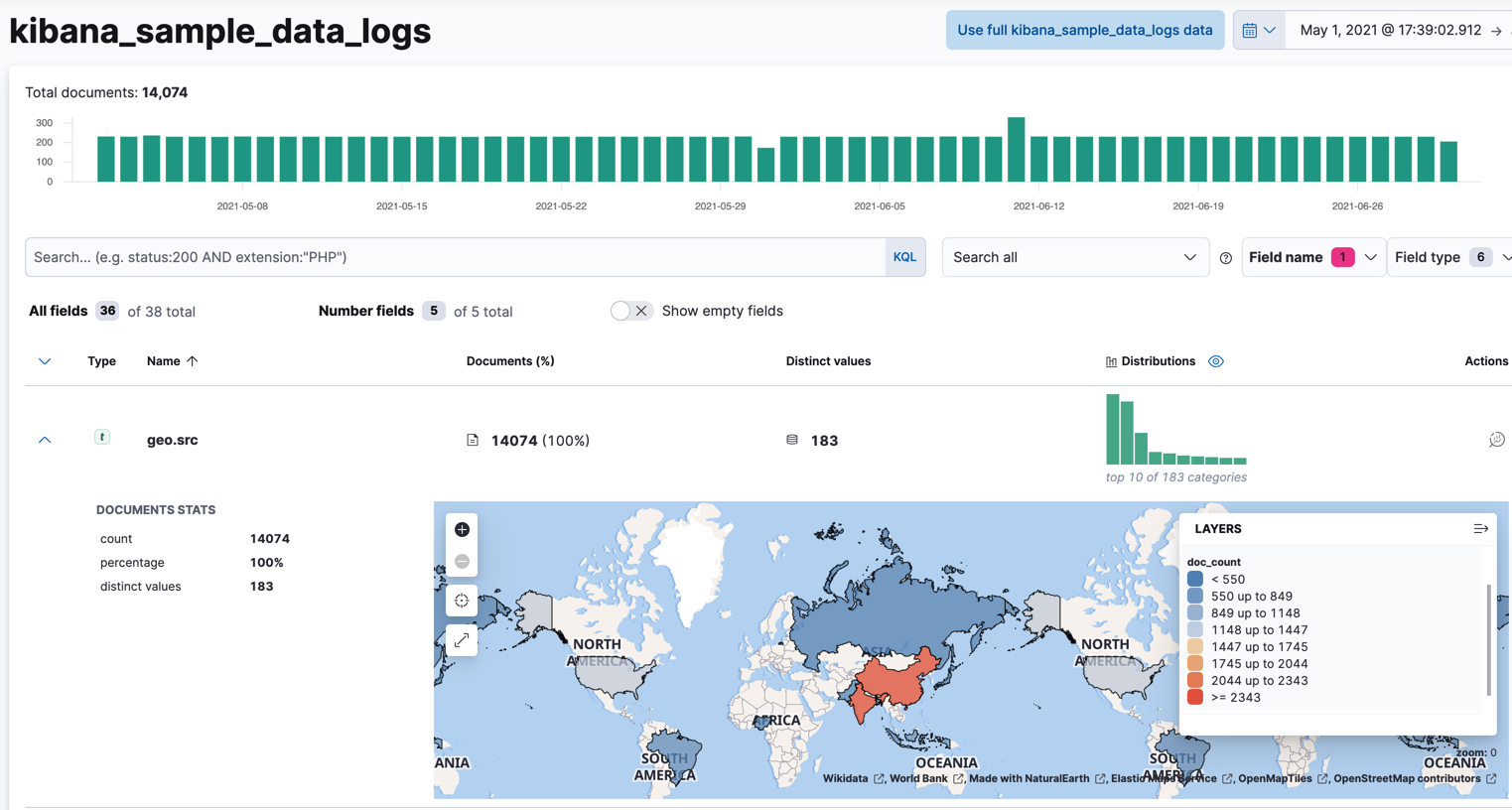
editIf you have fields that contain valid vector layers, you can use the Data Visualizer in the Machine Learning app to see a choropleth map, in which each area is colored based on its document count. For example:

Create an anomaly detection job
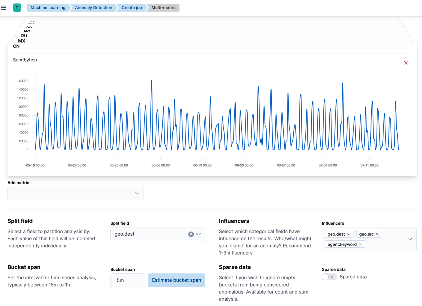
editTo create an anomaly detection job in Kibana, click Create job on the Machine learning > Anomaly detection page and select an appropriate job wizard. Alternatively, use the create anomaly detection jobs API.
For example, use the multi-metric job wizard to create a job that analyzes the
sample web logs data set to detect anomalous behavior in the sum of the data
transferred (bytes values) for each destination country (geo.dest values):

API example
PUT _ml/anomaly_detectors/weblogs-vectors
{
  "analysis_config" : {
    "bucket_span":"15m",
    "detectors": [
      {
        "detector_description": "Sum of bytes",
        "function": "sum",
        "field_name": "bytes",
        "partition_field_name": "geo.dest"
      }
    ],
    "influencers": [
    "geo.src",
    "agent.keyword",
    "geo.dest"
    ]
  },
  "data_description" : {
    "time_field": "timestamp"
  }
}

PUT _ml/datafeeds/datafeed-weblogs-vectors
{
    "job_id": "weblogs-vectors",
    "query": {
      "bool": {
        "must": [
          {
            "match_all": {}
          }
        ]
      }
    },
    "indices": [
      "kibana_sample_data_logs"
    ]
}

POST _ml/anomaly_detectors/weblogs-vectors/_open

POST _ml/datafeeds/datafeed-weblogs-vectors/_start
{
  "end": "2021-07-15T22:00:00Z"
}
Analyze the results
editAfter the anomaly detection jobs have processed some data, you can view the results in Kibana.
If you used APIs to create the jobs and datafeeds, you cannot see them in Kibana until you follow the prompts to synchronize the necessary saved objects.

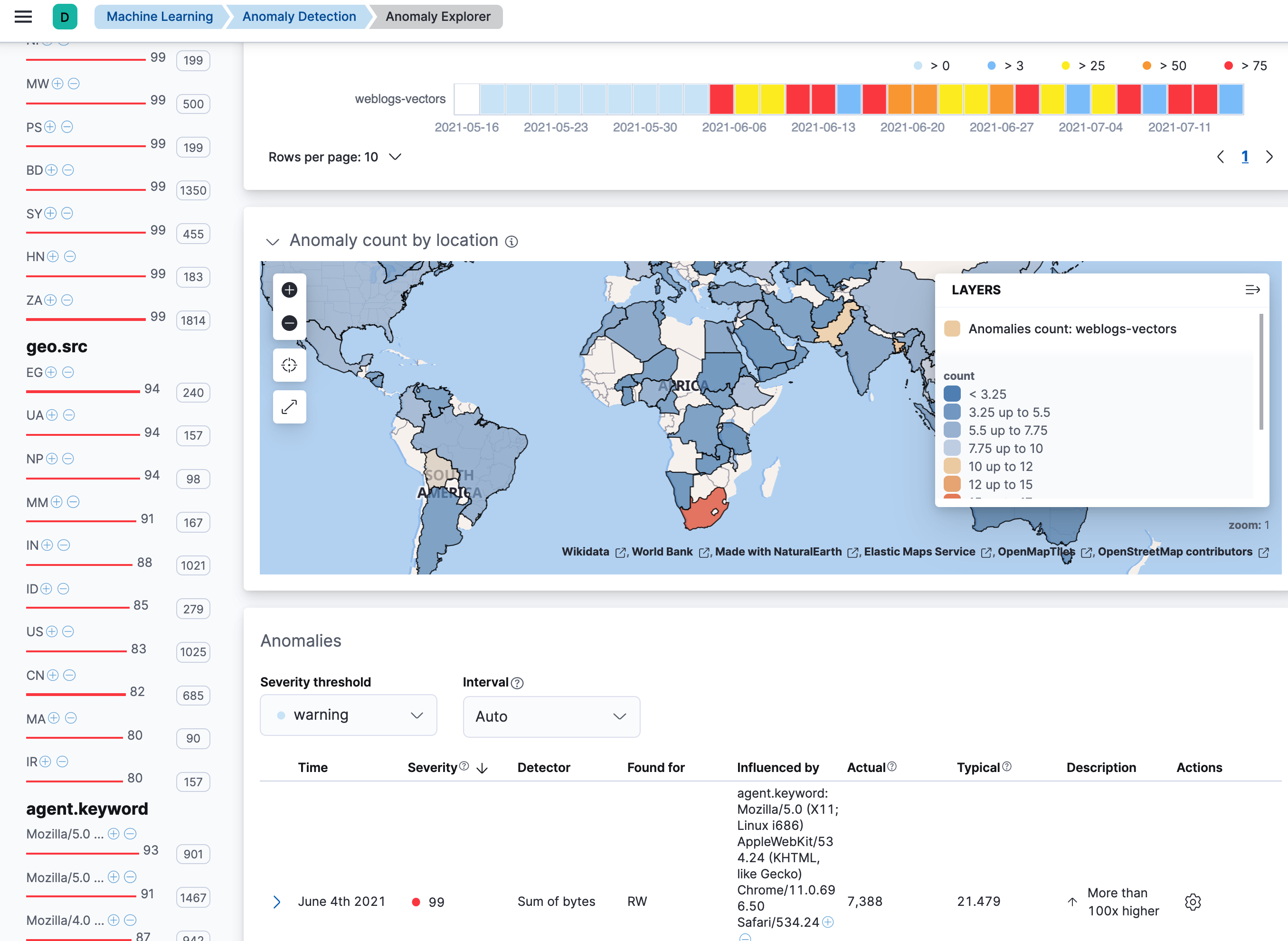
The Anomaly Explorer contains a map, which is affected by your swim lane selections. It colors each location to reflect the number of anomalies in that selected time period. Locations that have few anomalies are indicated in blue; locations with many anomalies are red. Thus you can quickly see the locations that are generating the most anomalies. If your vector layers define regions, counties, or postal codes, you can zoom in for fine details.