Autocomplete
When you start typing in a search box on ecommerce sites like Amazon or Best Buy, you might have seen a dropdown showing suggestions to try next. This is called autocomplete.
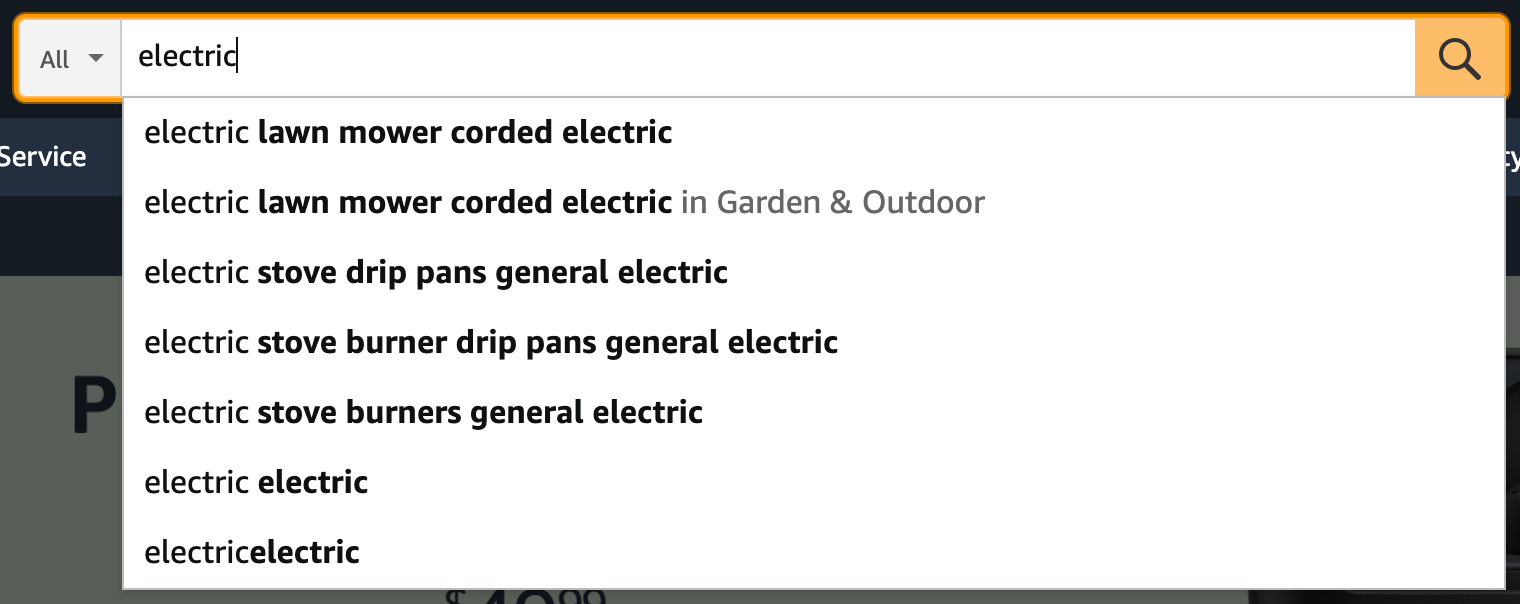
On some of the more popular ecommerce sites, you may see suggestions in the form of search suggestions, product categories, and products.
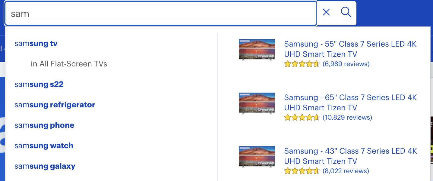
This article will discuss how to implement an autocomplete search box that provides multiple options on your ecommerce site.
Search UI can be used to provide different types of suggestions from multiple sources. For example, depending on your use case, you can display query suggestions, products from the product catalog, and a list of popular queries at the same time.
Test out the examples from this article in our interactive CodeSandbox demo - try searching for "monitor" to see it in action!
This tutorial builds on the searchbox autocomplete documentation.
Typically ecommerce sites have a search bar within the site’s header, which is accessible on every page.
For this tutorial, we will assume that the search bar is located in the site’s header.
Within the header, we need to use the SearchProvider and Searchbox components to integrate the autocomplete search box.
const config = {
  // search provider configuration for autocomplete
};

function NavigationHeader() {
  return (
    <div>
      <ComponyLogo />
      <BrowseNavigationLinks />
      <SearchProvider
        config={{
          ...config,
          trackUrlState: false
        }}
      >
        <SearchBox
          onSubmit={(searchTerm) => {
            window.location.href = `${PATH_TO_YOUR_SEARCH_PAGE}?q=${searchTerm}`;
          }}
        />
      </SearchProvider>
      <UserProfile />
    </div>
  );
}
Should you find the search bar markup too limiting to your needs, you can override the display using the optional inputView autocompleteView and resultsView props.
<SearchBox
  autocompleteView={({ autocompletedResults, getItemProps }) => (
    <div className="sui-search-box__autocomplete-container">
      {autocompletedResults.map((result, i) => (
        <div
          {...getItemProps({
            key: result.id.raw,
            item: result
          })}
          className="flex"
        >
          Result {i}: {result.title.snippet}
        </div>
      ))}
    </div>
  )}
/>
For more information of whats possible to customise, see searchbox autocomplete documentation.
Term Suggestions help the customer quickly type in the search term. The suggestions are based on keywords that are already present in the index. To do this, you need:
- An engine or index populated with products
To configure the SearchBox to provide suggestions based on keywords, you need to pass a config object to the SearchProvider component and configure the Searchbox autocompleteSuggestions to be true.

Example Code
const config = {
  autocompleteQuery: {
    resultsPerPage: 5,
    result_fields: {
      name: { snippet: { size: 100, fallback: true } },
      url: { raw: {} }
    },
    search_fields: {
      name_product_autocomplete: {}
    }
  }
};
<SearchBox
  autocompleteResults={{
    titleField: "name",
    urlField: "url"
  }}
/>
With this feature, products will be presented as suggestions to the customer. When the customer clicks on the product suggestion, they will be navigated straight to the product’s detail page.
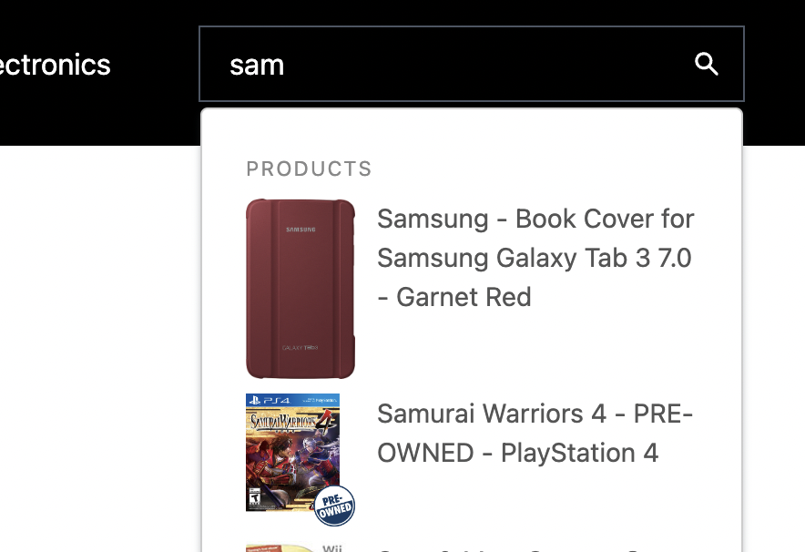
First, we specify the autocompleteQuery.results configuration:
const config = {
  alwaysSearchOnInitialLoad: false,
  autocompleteQuery: {
    results: {
      resultsPerPage: 5,
      result_fields: {
        // specify the fields you want from the index to display the results
        image: { raw: {} },
        name: { snippet: { size: 100, fallback: true } },
        url: { raw: {} }
      },
      search_fields: {
        // specify the fields you want to search on
        name: {}
      }
    }
  },
  apiConnector: connector
};
<SearchBox
  autocompleteResults={{
    titleField: "name",
    urlField: "url"
  }}
  autocompleteView={AutocompleteView}
/>
function AutocompleteView({
  autocompleteResults,
  autocompletedResults,
  autocompleteSuggestions,
  autocompletedSuggestions,
  className,
  getItemProps,
  getMenuProps
}) {
  let index = 0;
  return (
    <div
      {...getMenuProps({
        className: ["sui-search-box__autocomplete-container", className].join(
          " "
        )
      })}
    >
      <>
        {!!autocompleteSuggestions &&
          Object.entries(autocompletedSuggestions).map(
            ([suggestionType, suggestions]) => {
              return (
                <React.Fragment key={suggestionType}>
                  {getSuggestionTitle(
                    suggestionType,
                    autocompleteSuggestions
                  ) &&
                    suggestions.length > 0 && (
                      <div className="sui-search-box__section-title">
                        {getSuggestionTitle(
                          suggestionType,
                          autocompleteSuggestions
                        )}
Requires Elasticsearch Connector.
Sometimes you want to display suggestions from a different index than the one you use for search. For example, you might want to show suggestions from a popular_queries or a designers index. Search UI supports this within the autocompleteSuggestions configuration.
In this example, we will populate an index with popular queries. The mapping and example documents for the index will be as follows:
{
  "popular_queries" : {
      "mappings" : {
        "properties" : {
          "name" : {
            "type" : "text",
            "fields" : {
              "suggest" : {
              "type" : "search_as_you_type",
              "doc_values" : false,
              "max_shingle_size" : 3
              }
            }
          }
        }
      }
    }
}
{
  "name": "Iphone 4s"
}
Next, setup Search UI Searchbox and configuration to display suggestions from the popular_queries index.
const config = {
  alwaysSearchOnInitialLoad: false,
  autocompleteQuery: {
    suggestions: {
      types: {
        popularQueries: {
          search_fields: {
            "name.suggest": {}
          },
          result_fields: {
            name: {
              raw: {}
            }
          },
          index: "popular_queries",
          queryType: "results"
        }
      },
      size: 4
    }
  },
  apiConnector: connector
};
- fields used to query
<SearchBox
  autocompleteSuggestions={{
    popularQueries: {
      sectionTitle: "Popular queries",
      queryType: "results",
      displayField: "name"
    }
  }}
/>
Now, when you type was in the SearchBox, the autocomplete view will display the popular queries:
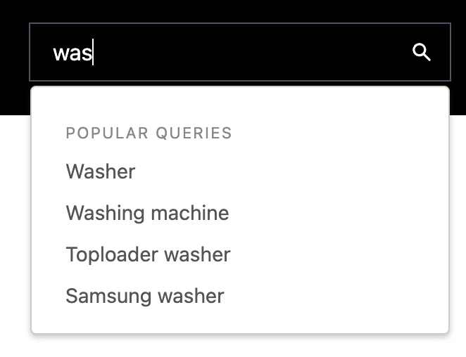
If you want to display more fields from the index, you can use the result_fields configuration and implement a custom autocompleteView to display these fields.
Combining the suggestion configurations above allows you to display suggestions from multiple sources simultaneously.
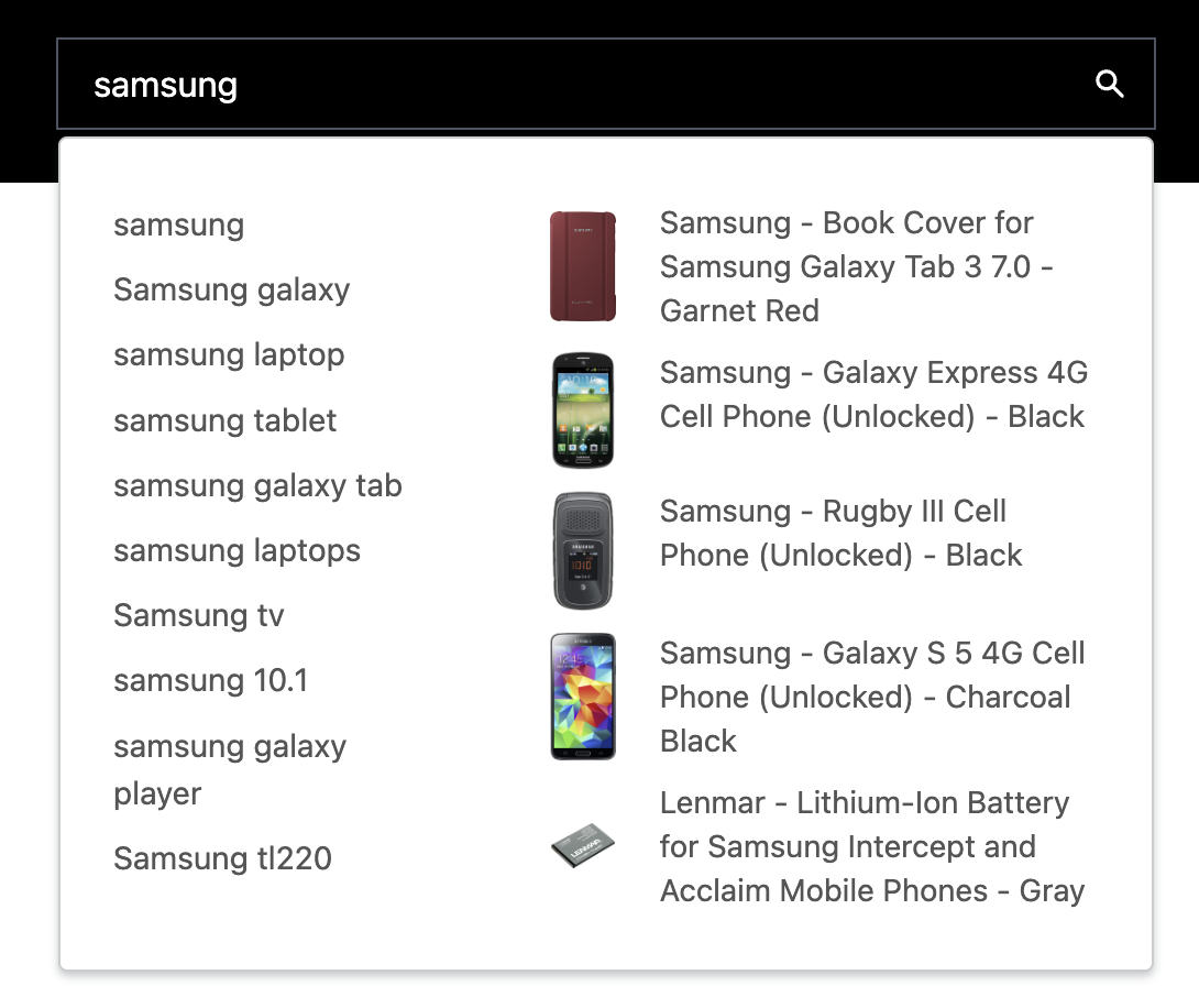
To do this, extend the autocompleteQuery configuration to specify multiple sources. For example, in the screenshot above, we customized the autocompleteView CSS to display the popular queries and the results from the autocompleteSuggestions configuration side by side and hide the section titles.
const config = {
  alwaysSearchOnInitialLoad: false,
  autocompleteQuery: {
    suggestions: {
      types: {
        popularQueries: {
          search_fields: {
            "name.suggest": {}
          },
          result_fields: {
            name: {
              raw: {}
            }
          },
          index: "popular_queries",
          queryType: "results"
        }
      },
      size: 4
    }
  },
  apiConnector: connector
};
- fields used to query
<SearchBox
  autocompleteResults={{
    sectionTitle: "Products",
    titleField: "name",
    urlField: "url"
  }}
  autocompleteSuggestions={{
    popularQueries: {
      sectionTitle: "Popular queries",
      queryType: "results",
      displayField: "name"
    }
  }}
/>