Master time with Kibana’s new time series visual builder
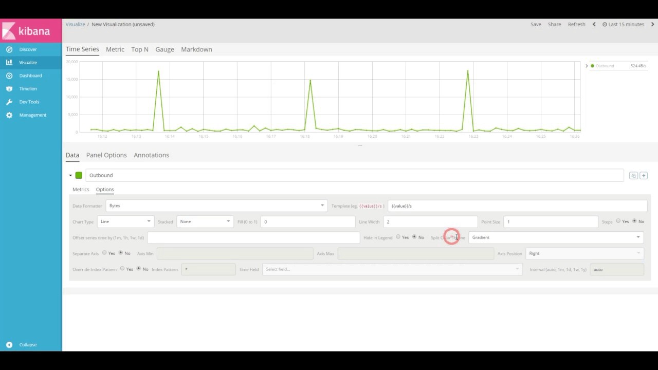
We love visualizing data, especially time series data, which is why we created a new UI that specializes in manipulating and viewing it. Kibana's new time series visual builder combines the power of Elasticsearch's pipeline aggregations with an easy-to-use interface for analyzing and monitoring your data in as few clicks as possible.
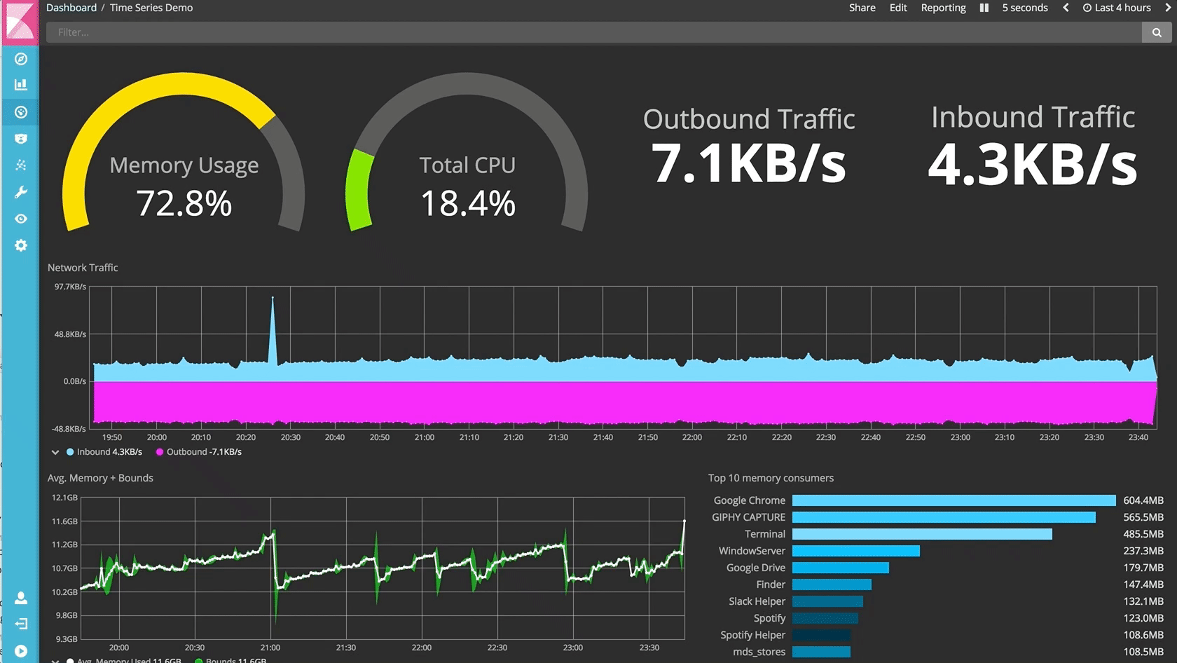
With this bold new interface, you can create a dashboard like the one above by taking advantage of the following features:
- Trend and analyze multiple index patterns in the same visualization
- Customize every aspect of your visualization - from date format to color gradients, make each time series visualization your own
- Effortlessly build complex calculations that combine basic metric aggregations with pipeline aggregations
- Conditionally color your visualization with user-defined thresholds
- Compare your current data to a previous timeframes by defining the offset for a second metric
- Switch between time series, metric, top N, gauge and markdown visualizations for the same data in this data-driven visual builder
- Define and customize annotations in your trend chart when a data point matches a set of criteria
Excited to get started? Check out the introduction video to the new time series visual builder below. To follow along, make sure you have Kibana 5.4 downloaded, Metricbeat data indexed, and the documentation handy.
This will be the first in our time series of blog posts. Be on the lookout for our next video tutorial! Can't wait? Have a look at this great live Kibana Visualizations Deep Dive demo from Elastic{ON} 2017.
This feature is experimental so your feedback is crucial. Please feel free to ping us on Discuss, GitHub, and Twitter.
Related posts in this series:
- Part 2 - Changing visualization types, creating metric aggregations, and conditionally styling a metric visualization