- Machine Learning: other versions:
- What is Elastic Machine Learning?
- Setup and security
- Anomaly detection
- Finding anomalies
- Tutorial: Getting started with anomaly detection
- Advanced concepts
- API quick reference
- How-tos
- Generating alerts for anomaly detection jobs
- Aggregating data for faster performance
- Altering data in your datafeed with runtime fields
- Customizing detectors with custom rules
- Detecting anomalous categories of data
- Reverting to a model snapshot
- Detecting anomalous locations in geographic data
- Mapping anomalies by location
- Adding custom URLs to machine learning results
- Anomaly detection jobs from visualizations
- Exporting and importing machine learning jobs
- Resources
- Data frame analytics
- Natural language processing
Predicting classes with classification
editPredicting classes with classification
editClassification is a machine learning process that predicts the class or category of a data point in a data set. For a simple example, consider how the shapes in the following graph can be differentiated and classified as "circles" and "triangles":
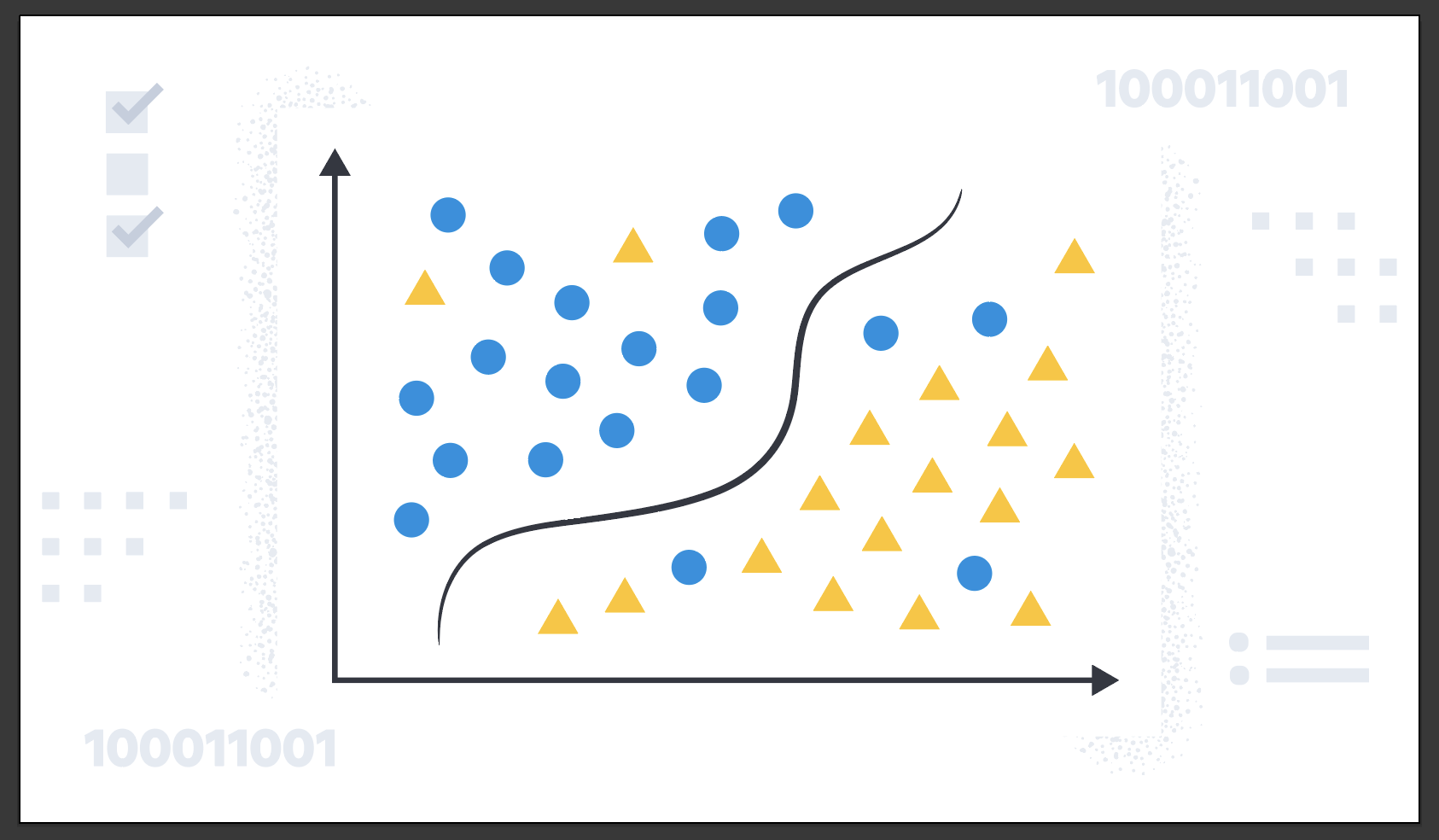
In reality, classification problems are more complex, such as classifying malicious and benign domains to detect DGA activities for security reasons or predicting customer churn based on customer calling data. Classification is for predicting discrete, categorical values.
When you create a classification job, you must specify which field contains the classes that you want to predict. This field is known as the dependent variable. It can contain maximum 100 classes. By default, all other supported fields are included in the analysis and are known as feature variables. You can optionally include or exclude fields. For more information about field selection, refer to the explain data frame analytics API.
Classification algorithms
editClassification analysis uses an ensemble algorithm that is similar to extreme gradient boosting (XGBoost) which combines multiple weak models into a composite one. It uses decision trees to learn to predict the probability that a data point belongs to a certain class. XGBoost trains a sequence of decision trees and every decision tree learns from the mistakes of the forest so far. In each iteration, the trees added to the forest improve the decision quality of the combined decision forest. The classification algorithm optimizes for a loss function called cross-entropy loss.
1. Define the problem
editClassification can be useful in cases where discrete, categorical values needs to be predicted. If your use case requires predicting such values, then classification might be the suitable choice for you.
2. Set up the environment
editBefore you can use the Elastic Stack machine learning features, there are some configuration requirements (such as security privileges) that must be addressed. Refer to Setup and security.
3. Prepare and transform data
editClassification is a supervised machine learning method, which means you need to supply a labeled training data set. This data set must have values for the feature variables and the dependent variable which are used to train the model. The training process uses this information to learn the relationships between the classes and the feature variables. This labeled data set also plays a critical role in model evaluation.
If possible, prepare your input data such that it has less classes. A classification analysis with many classes takes more time to run than a binary classification job. The relationship between the number of classes and the runtime is roughly linear.
You might also need to transform your data to create a data frame which can be used as the source for classification.
To learn more about how to prepare your data, refer to the relevant section of the supervised learning overview.
4. Create a job
editData frame analytics jobs contain the configuration information and metadata necessary to perform an analytics task. You can create data frame analytics jobs via Kibana or using the create data frame analytics jobs API.
Select classification as the analytics type, then select the field that you want to predict (the dependent variable). You can also include and exclude fields.
You can view the statistics of the selectable fields in the data frame analytics wizard. The field statistics displayed in a flyout provide more meaningful context to help you select relevant fields.
To improve performance, consider using a small training_percent value to train
the model more quickly. It is a good strategy to make progress iteratively: run
the analysis with a small training percentage, then evaluate the performance.
Based on the results, you can decide if it is necessary to increase the
training_percent value.
5. Start the job
editYou can start the job via Kibana or using the start data frame analytics jobs API. A classification job has the following phases:
-
reindexing: Documents are copied from the source index to the destination index. -
loading_data: The job fetches the necessary data from the destination index. -
feature_selection: The process identifies the most relevant analyzed fields for predicting the dependent variable. -
coarse_parameter_search: The process identifies initial values for undefined hyperparameters. -
fine_tuning_parameters: The process identifies final values for undefined hyperparameters. Refer to hyperparameter optimization. -
final_training: The model training occurs. -
writing_results: The job matches the results with the data rows in the destination index, merges them, and indexes them back to the destination index. -
inference: The job validates the trained model against the test split of the data set.
After the last phase is finished, the job stops and the results are ready for evaluation.
When you create a data frame analytics job, the inference step of the process might fail if the model is too large to fit into JVM. For a workaround, refer to this GitHub issue.
6. Evaluate and interpret the result
editUsing the data frame analytics features to gain insights from a data set is an iterative process. After you defined the problem you want to solve, and chose the analytics type that can help you to do so, you need to produce a high-quality data set and create the appropriate data frame analytics job. You might need to experiment with different configurations, parameters, and ways to transform data before you arrive at a result that satisfies your use case. A valuable companion to this process is the evaluate data frame analytics API, which enables you to evaluate the data frame analytics performance. It helps you understand error distributions and identifies the points where the data frame analytics model performs well or less trustworthily.
To evaluate the analysis with this API, you need to annotate your index that contains the results of the analysis with a field that marks each document with the ground truth. The evaluate data frame analytics API evaluates the performance of the data frame analytics against this manually provided ground truth.
You can measure how well the model has performed on your training data set by
using the classification evaluation type of the
evaluate data frame analytics API or by viewing the
job results in Kibana. The classification evaluation offers the following
metrics to evaluate the model performance:
- Multiclass confusion matrix
- Area under the curve of receiver operating characteristic (AUC ROC)
The following metrics helps you interpret the analysis results:
- feature importance
-
class_probability -
class_score
Multiclass confusion matrix
editThe multiclass confusion matrix provides a summary of the performance of the classification analysis. It contains the number of occurrences where the analysis classified data points correctly with their actual class as well as the number of occurrences where it misclassified them.
This is an example of a confusion matrix for a binary problem:

It is a two by two matrix because there are only two classes (true and
false). It shows the proportion of data points that is correctly identified as
members of a each class and the proportion that is misidentified.
As the number of classes increases, the confusion matrix becomes more complex:

This matrix contains the actual labels on the left side while the predicted labels are on the top. The proportion of correct and incorrect predictions is broken down for each class. This enables you to examine how the classification analysis confused the different classes while it made its predictions.
Area under the curve of receiver operating characteristic (AUC ROC)
editThe receiver operating characteristic (ROC) curve is a plot that represents the performance of the classification process at different predicted probability thresholds. It compares the true positive rate for a specific class against the rate of all the other classes combined ("one versus all" strategy) at the different threshold levels to create the curve.
For example, there are three classes: A, B, and C, and AUC ROC is
calculated for A. In this case, the number of correctly classified As
(true positives) are compared to the number of Bs and Cs that are
misclassified as As (false positives).
From this plot, you can compute the area under the curve (AUC) value, which is a
number between 0 and 1. The higher the AUC, the better the model is at
predicting As as As, in this case.
To use this evaluation method, you must set num_top_classes to -1
or a value greater than or equal to the total number of classes when you create
the data frame analytics job.
Feature importance
editFeature importance provides further information about the results of an analysis and helps to interpret the results in a more subtle way. If you want to learn more about feature importance, refer to Feature importance.
class_probability
editThe class_probability is a value between 0 and 1, which indicates how likely
it is that a given data point belongs to a certain class. The higher the number,
the higher the probability that the data point belongs to the named class. This
information is stored in the top_classes array for each document in the
destination index.
class_score
editThe class_score is a function of the class_probability and has a value that
is greater than or equal to zero. It takes into consideration your objective (as
defined in the class_assignment_objective job configuration option):
accuracy or recall.
If your objective is to maximize accuracy, the scores are weighted to maximize the proportion of correct predictions in the training data set.

If there is an imbalanced class distribution in your training data, focusing on accuracy can decrease your model’s sensitivity to incorrect predictions in the under-represented classes.
By default, classification analysis jobs accept a slight degradation of the overall accuracy in return for greater sensitivity to classes that are predicted incorrectly. That is to say, their objective is to maximize the minimum recall. For example, in the context of a multi-class confusion matrix, the predictions of interest are in each row:

For each class, the recall is calculated as the number of correct predictions divided by the sum of all the other predicted labels in that row. This value is represented as a percentage in each cell of the confusion matrix. The class scores are then weighted to favor predictions that result in the highest recall values across the training data. This objective typically performs better than accuracy when you have highly imbalanced data.
To learn more about choosing the class assignment objective that fits your goal, refer to this Jupyter notebook.
7. Deploy the model
editThe model that you created is stored as Elasticsearch documents in internal indices. In other words, the characteristics of your trained model are saved and ready to be deployed and used as functions.
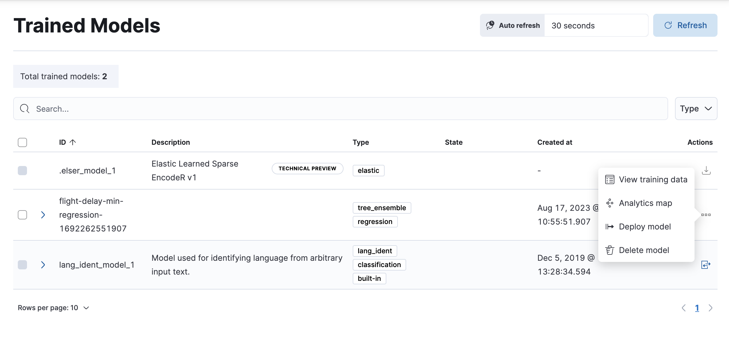
- To deploy data frame analytics model in a pipeline, navigate to Machine Learning > Model Management > Trained models in Kibana.
-
Find the model you want to deploy in the list and click Deploy model in the Actions menu.
-
Create an inference pipeline to be able to use the model against new data through the pipeline. Add a name and a description or use the default values.

-
Configure the pipeline processors or use the default settings.

- Configure to handle ingest failures or use the default settings.
- (Optional) Test your pipeline by running a simulation of the pipeline to confirm it produces the anticipated results.
- Review the settings and click Create pipeline.
The model is deployed and ready to use through the inference pipeline.
Inference
editInference enables you to use trained machine learning models against incoming data in a continuous fashion.
For instance, suppose you have an online service and you would like to predict whether a customer is likely to churn. You have an index with historical data – information on the customer behavior throughout the years in your business – and a classification model that is trained on this data. The new information comes into a destination index of a continuous transform. With inference, you can perform the classification analysis against the new data with the same input fields that you’ve trained the model on, and get a prediction.
Inference processor
editInference can be used as a processor specified in an ingest pipeline. It uses a trained model to infer against the data that is being ingested in the pipeline. The model is used on the ingest node. Inference pre-processes the data by using the model and provides a prediction. After the process, the pipeline continues executing (if there is any other processor in the pipeline), finally the new data together with the results are indexed into the destination index.
Check the inference processor and the machine learning data frame analytics API documentation to learn more.
Inference aggregation
editInference can also be used as a pipeline aggregation. You can reference a trained model in the aggregation to infer on the result field of the parent bucket aggregation. The inference aggregation uses the model on the results to provide a prediction. This aggregation enables you to run classification or regression analysis at search time. If you want to perform the analysis on a small set of data, this aggregation enables you to generate predictions without the need to set up a processor in the ingest pipeline.
Check the inference bucket aggregation and the machine learning data frame analytics API documentation to learn more.
If you use trained model aliases to reference your trained model in an inference processor or inference aggregation, you can replace your trained model with a new one without the need of updating the processor or the aggregation. Reassign the alias you used to a new trained model ID by using the Create or update trained model aliases API. The new trained model needs to use the same type of data frame analytics as the old one.
Performing classification analysis in the sample flight data set
editLet’s try to predict whether a flight will be delayed or not by using the
sample flight data. The
data set contains information such as weather conditions, carrier, flight
distance, origin, destination, and whether or not the flight was delayed. The
classification model learns the relationships between the fields in your data
to predict the value of the dependent variable, which in this case is the
boolean FlightDelay field.
If you want to view this example in a Jupyter notebook, click here.
Preparing your data
editEach document in the sample flight data set contains details for a single flight, so the data is ready for analysis; it is already in a two-dimensional entity-based data structure. In general, you often need to transform the data into an entity-centric index before you can analyze it.
In order to be analyzed, a document must contain at least one field with a
supported data type (numeric, boolean, text, keyword or ip) and must
not contain arrays with more than one item. If your source data consists of some
documents that contain the dependent variable and some that do not, the model is
trained on the subset of documents that contain it.
Example source document
{
  "_index": "kibana_sample_data_flights",
  "_type": "_doc",
  "_id": "S-JS1W0BJ7wufFIaPAHe",
  "_version": 1,
  "_seq_no": 3356,
  "_primary_term": 1,
  "found": true,
  "_source": {
    "FlightNum": "N32FE9T",
    "DestCountry": "JP",
    "OriginWeather": "Thunder & Lightning",
    "OriginCityName": "Adelaide",
    "AvgTicketPrice": 499.08518599798685,
    "DistanceMiles": 4802.864932998549,
    "FlightDelay": false,
    "DestWeather": "Sunny",
    "Dest": "Chubu Centrair International Airport",
    "FlightDelayType": "No Delay",
    "OriginCountry": "AU",
    "dayOfWeek": 3,
    "DistanceKilometers": 7729.461862731618,
    "timestamp": "2019-10-17T11:12:29",
    "DestLocation": {
      "lat": "34.85839844",
      "lon": "136.8049927"
    },
    "DestAirportID": "NGO",
    "Carrier": "ES-Air",
    "Cancelled": false,
    "FlightTimeMin": 454.6742272195069,
    "Origin": "Adelaide International Airport",
    "OriginLocation": {
      "lat": "-34.945",
      "lon": "138.531006"
    },
    "DestRegion": "SE-BD",
    "OriginAirportID": "ADL",
    "OriginRegion": "SE-BD",
    "DestCityName": "Tokoname",
    "FlightTimeHour": 7.577903786991782,
    "FlightDelayMin": 0
  }
}
The sample flight data set is used in this example because it is easily accessible. However, the data has been manually created and contains some inconsistencies. For example, a flight can be both delayed and canceled. This is a good reminder that the quality of your input data affects the quality of your results.
Creating a classification model
editTo predict whether a specific flight is delayed:
-
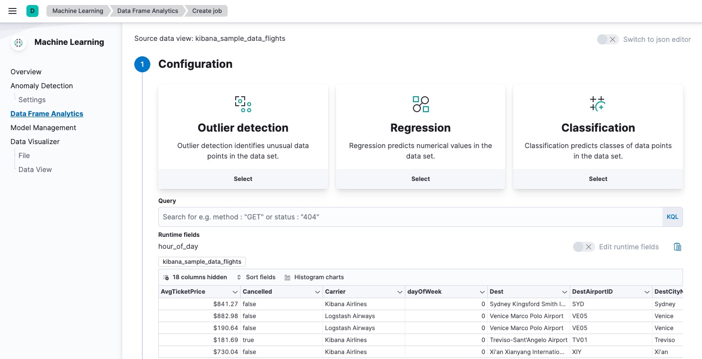
Create a data frame analytics job.
You can use the wizard on the Machine Learning > Data Frame Analytics tab in Kibana or the create data frame analytics jobs API.
-
Choose
kibana_sample_data_flightsas the source index. -
Choose
classificationas the job type. -
Choose
FlightDelayas the dependent variable, which is the field that we want to predict with the classification analysis. -
Add
Cancelled,FlightDelayMin, andFlightDelayTypeto the list of excluded fields. It is recommended to exclude fields that either contain erroneous data or describe thedependent_variable.The wizard includes a scatterplot matrix, which enables you to explore the relationships between the numeric fields. The color of each point is affected by the value of the dependent variable for that document, as shown in the legend. You can highlight an area in one of the charts and the corresponding area is also highlighted in the rest of the charts. You can use this matrix to help you decide which fields to include or exclude.
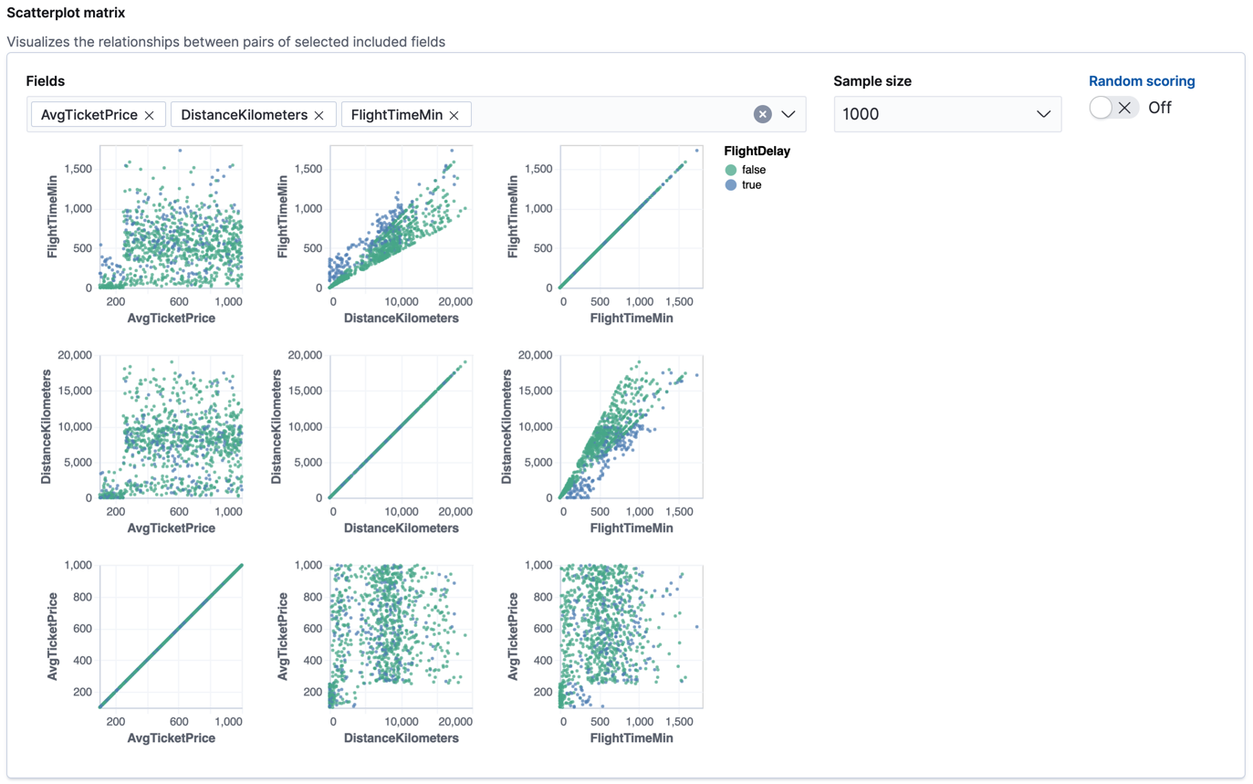
If you want these charts to represent data from a larger sample size or from a randomized selection of documents, you can change the default behavior. However, a larger sample size might slow down the performance of the matrix and a randomized selection might put more load on the cluster due to the more intensive query.
-
Choose a training percent of
10which means it randomly selects 10% of the source data for training. While that value is low for this example, for many large data sets using a small training sample greatly reduces runtime without impacting accuracy. - If you want to experiment with feature importance, specify a value in the advanced configuration options. In this example, a maximum of 10 feature importance values per document will return. This option affects the speed of the analysis, so by default it is disabled.
- Use the default memory limit for the job. If the job requires more than this amount of memory, it fails to start. If the available memory on the node is limited, this setting makes it possible to prevent job execution.
-
Add a job ID (such as
model-flight-delays-classification) and optionally a job description. - Add the name of the destination index that will contain the results. In Kibana, the index name matches the job ID by default. It will contain a copy of the source index data where each document is annotated with the results. If the index does not exist, it will be created automatically.
-
Use default values for all other options.
API example
PUT _ml/data_frame/analytics/model-flight-delays-classification
{
  "source": {
    "index": [
      "kibana_sample_data_flights"
    ]
  },
  "dest": {
    "index": "model-flight-delays-classification",
    "results_field": "ml"
  },
  "analysis": {
    "classification": {
      "dependent_variable": "FlightDelay",
      "training_percent": 10,
      "num_top_feature_importance_values": 10
    }
  },
  "analyzed_fields": {
    "includes": [],
    "excludes": [
      "Cancelled",
      "FlightDelayMin",
      "FlightDelayType"
    ]
  }
}
After you configured your job, the configuration details are automatically validated. If the checks are successful, you can start the job. A warning message is shown if the configuration is invalid. The message contains a suggestion to improve the configuration to be validated.
-
Choose
-
Start the job in Kibana or use the start data frame analytics jobs API.
The job takes a few minutes to run. Runtime depends on the local hardware and also on the number of documents and fields that are analyzed. The more fields and documents, the longer the job runs. It stops automatically when the analysis is complete.
API example
POST _ml/data_frame/analytics/model-flight-delays-classification/_start
-
Check the job stats to follow the progress in Kibana or use the get data frame analytics jobs statistics API.
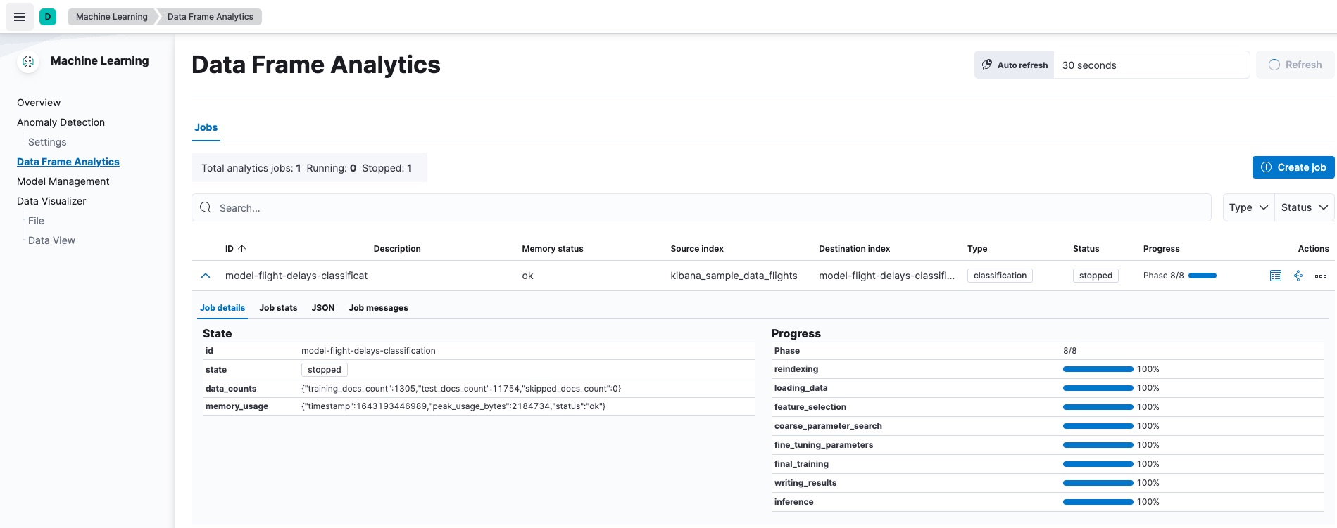
When the job stops, the results are ready to view and evaluate. To learn more about the job phases, see How data frame analytics jobs work.
API example
GET _ml/data_frame/analytics/model-flight-delays-classification/_stats
The API call returns the following response:
{
  "count" : 1,
  "data_frame_analytics" : [
    {
      "id" : "model-flight-delays-classification",
      "state" : "stopped",
      "progress" : [
        {
          "phase" : "reindexing",
          "progress_percent" : 100
        },
        {
          "phase" : "loading_data",
          "progress_percent" : 100
        },
        {
          "phase" : "feature_selection",
          "progress_percent" : 100
        },
        {
          "phase" : "coarse_parameter_search",
          "progress_percent" : 100
        },
        {
          "phase" : "fine_tuning_parameters",
          "progress_percent" : 100
        },
        {
          "phase" : "final_training",
          "progress_percent" : 100
        },
        {
          "phase" : "writing_results",
          "progress_percent" : 100
        },
        {
          "phase" : "inference",
          "progress_percent" : 100
        }
      ],
      "data_counts" : {
        "training_docs_count" : 1305,
        "test_docs_count" : 11754,
        "skipped_docs_count" : 0
      },
      "memory_usage" : {
        "timestamp" : 1597182490577,
        "peak_usage_bytes" : 316613,
        "status" : "ok"
      },
      "analysis_stats" : {
        "classification_stats" : {
          "timestamp" : 1601405047110,
          "iteration" : 18,
          "hyperparameters" : {
            "class_assignment_objective" : "maximize_minimum_recall",
            "alpha" : 0.7633136599817167,
            "downsample_factor" : 0.9473152348018332,
            "eta" : 0.02331774683318904,
            "eta_growth_rate_per_tree" : 1.0143154178910303,
            "feature_bag_fraction" : 0.5504020748926737,
            "gamma" : 0.26389161802240446,
            "lambda" : 0.6309726978583623,
            "max_attempts_to_add_tree" : 3,
            "max_optimization_rounds_per_hyperparameter" : 2,
            "max_trees" : 894,
            "num_folds" : 5,
            "num_splits_per_feature" : 75,
            "soft_tree_depth_limit" : 4.672705943455812,
            "soft_tree_depth_tolerance" : 0.13448633124842999
            },
            "timing_stats" : {
              "elapsed_time" : 76459,
              "iteration_time" : 1861
            },
            "validation_loss" : {
              "loss_type" : "binomial_logistic"
            }
          }
      }
    }
  ]
}
Viewing classification results
editNow you have a new index that contains a copy of your source data with predictions for your dependent variable.
When you view the classification results in Kibana, it shows the contents of the destination index in a tabular format. It also provides information about the analysis details, model evaluation metrics, total feature importance values, and a scatterplot matrix.
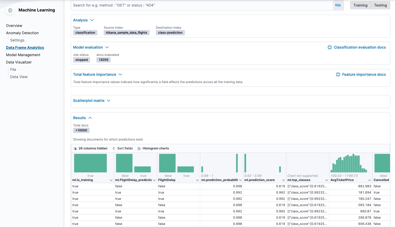
The table shows a column for the dependent variable (FlightDelay), which contains the
ground truth values that you are trying to predict. It also shows a column for
the predicted values (ml.FlightDelay_prediction), which were generated by the
classification analysis. The ml.is_training column indicates whether the document was
used in the training or testing data set. You can use the Training and
Testing filter options to refine the contents of the results table. You can
also enable histogram charts to get a better understanding of the distribution
of values.
If you want to understand how certain the model is about each prediction, you
can examine its probability and score (ml.prediction_probability and
ml.prediction_score). The higher these values are, the more confident the
model is that the data point belongs to the named class. If you examine the
destination index more closely in the Discover app in Kibana or use the
standard Elasticsearch search command, you can see that the analysis predicts the
probability of all possible classes for the dependent variable. The top_classes object
contains the predicted classes with the highest scores.
If you have a large number of classes, your destination index contains a
large number of predicted probabilities for each document. When you create the
classification job, you can use the num_top_classes option to modify this
behavior.
API example
GET model-flight-delays-classification/_search
The snippet below shows the probability and score details for a document in the destination index:
          ...
          "FlightDelay" : false,
          ...
          "ml" : {
            "FlightDelay_prediction" : false,
            "top_classes" : [
              {
                "class_name" : false,
                "class_probability" : 0.9427605087816684,
                "class_score" : 0.3462468700158476
              },
              {
                "class_name" : true,
                "class_probability" : 0.057239491218331606,
                "class_score" : 0.057239491218331606
              }
            ],
            "prediction_probability" : 0.9427605087816684,
            "prediction_score" : 0.3462468700158476,
            ...
The class with the highest score is the prediction. In this example, false has
a class_score of 0.35 while true has only 0.06, so the prediction will be
false. For more details about these values, see
class_score.
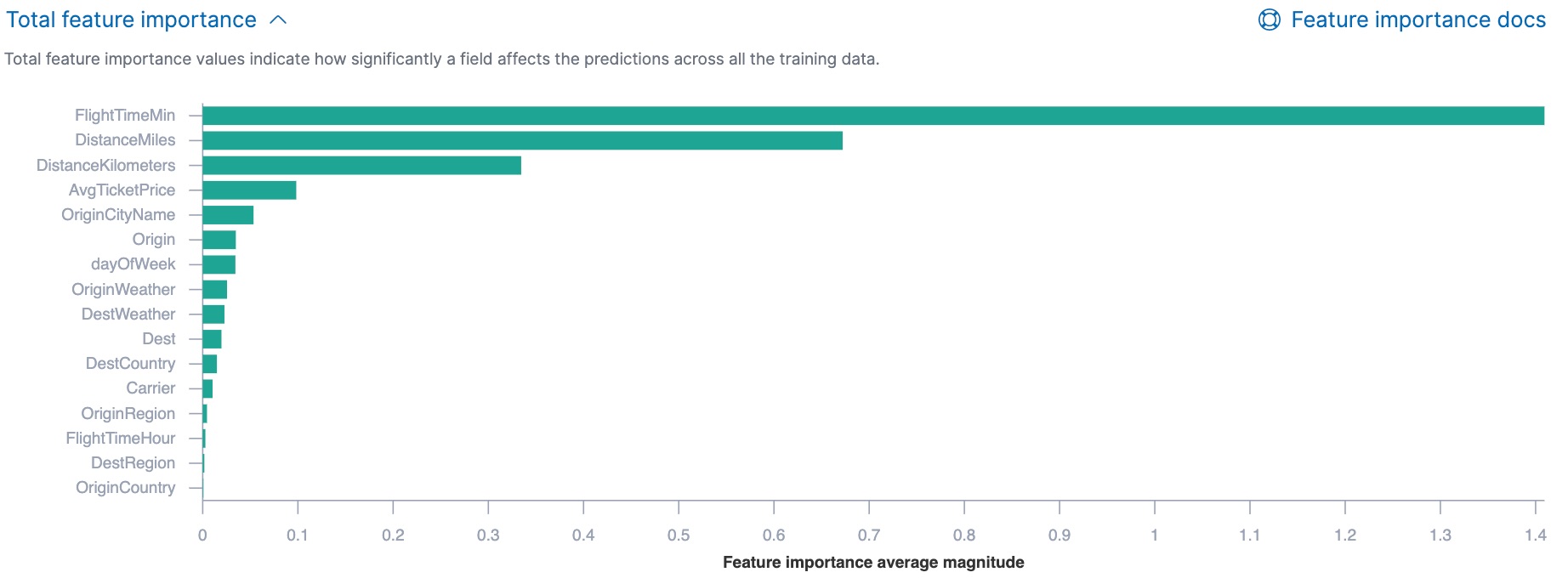
If you chose to calculate feature importance, the destination index also contains
ml.feature_importance objects. Every field that is included in the
analysis (known as a feature of the data point) is assigned a feature importance
value. It has both a magnitude and a direction (positive or negative), which
indicates how each field affects a particular prediction. Only the most
significant values (in this case, the top 10) are stored in the index. However,
the trained model metadata also contains the average magnitude of the feature importance
values for each field across all the training data. You can view this
summarized information in Kibana:
You can also see the feature importance values for each individual prediction in the form of a decision plot:
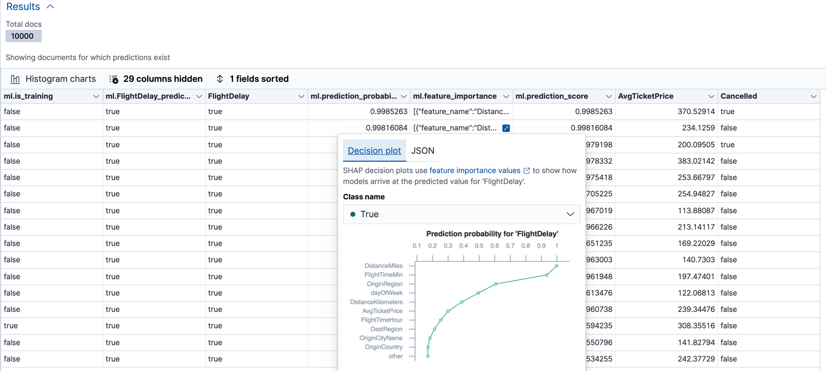
In Kibana, the decision path shows the relative impact of each feature on the probability of the prediction. The features with the most significant positive or negative impact appear at the top of the decision plot. Thus in this example, the features related to flight time and distance had the most significant influence on the probability value for this prediction. This type of information can help you to understand how models arrive at their predictions. It can also indicate which aspects of your data set are most influential or least useful when you are training and tuning your model.
If you do not use Kibana, you can see the summarized feature importance values by using the get trained model API and the individual values by searching the destination index.
API example
GET _ml/trained_models/model-flight-delays-classification*?include=total_feature_importance
The snippet below shows an example of the total feature importance and the corresponding baseline in the trained model metadata:
{
  "count" : 1,
  "trained_model_configs" : [
    {
      "model_id" : "model-flight-delays-classification-1601405047985",
      ...
      "metadata" : {
        ...
        "feature_importance_baseline" : {
          "classes" : [
            {
              "class_name" : true,
              "baseline" : -1.5869016940485443
            },
            {
              "class_name" : false,
              "baseline" : 1.5869016940485443
            }
          ]
        },
        "total_feature_importance" : [
          {
            "feature_name" : "dayOfWeek",
            "classes" : [
              {
                "class_name" : false,
                "importance" : {
                  "mean_magnitude" : 0.037513174351966404,
                  "min" : -0.20132653028125566,
                  "max" : 0.20132653028125566
                }
              },
              {
                "class_name" : true,
                "importance" : {
                  "mean_magnitude" : 0.037513174351966404,
                  "min" : -0.20132653028125566,
                  "max" : 0.20132653028125566
                }
              }
            ]
          },
          {
            "feature_name" : "OriginWeather",
            "classes" : [
              {
                "class_name" : false,
                "importance" : {
                  "mean_magnitude" : 0.05486662317369895,
                  "min" : -0.3337477336556598,
                  "max" : 0.3337477336556598
                }
              },
              {
                "class_name" : true,
                "importance" : {
                  "mean_magnitude" : 0.05486662317369895,
                  "min" : -0.3337477336556598,
                  "max" : 0.3337477336556598
                }
              }
            ]
          },
          ...
|
This object contains the baselines that are used to calculate the feature importance decision paths in Kibana. |
|
|
This value is the average of the absolute feature importance values for the
|
|
|
This value is the minimum feature importance value across all the training data for
this field when the predicted class is |
|
|
This value is the maximum feature importance value across all the training data for
this field when the predicted class is |
To see the top feature importance values for each prediction, search the destination index. For example:
GET model-flight-delays-classification/_search
The snippet below shows an example of the feature importance details for a document in the search results:
          ...
          "FlightDelay" : false,
          ...
          "ml" : {
            "FlightDelay_prediction" : false,
            ...
            "prediction_probability" : 0.9427605087816684,
            "prediction_score" : 0.3462468700158476,
            "feature_importance" : [
              {
                "feature_name" : "DistanceMiles",
                "classes" : [
                  {
                    "class_name" : false,
                    "importance" : -1.4766536146534828
                  },
                  {
                    "class_name" : true,
                    "importance" : 1.4766536146534828
                  }
                ]
              },
              {
                "feature_name" : "FlightTimeMin",
                "classes" : [
                  {
                    "class_name" : false,
                    "importance" : 1.0919201754729184
                  },
                  {
                    "class_name" : true,
                    "importance" : -1.0919201754729184
                  }
                ]
              },
              ...
The sum of the feature importance values for each class in this data point approximates the logarithm of its odds.
Lastly, Kibana provides a scatterplot matrix in the results. It has the same functionality as the matrix that you saw in the job wizard. Its purpose is to help you visualize and explore the relationships between the numeric fields and the dependent variable.
Evaluating classification results
editThough you can look at individual results and compare the predicted value
(ml.FlightDelay_prediction) to the actual value (FlightDelay), you
typically need to evaluate the success of your classification model as a
whole.
Kibana provides a normalized confusion matrix that contains the percentage of occurrences where the analysis classified data points correctly with their actual class and the percentage of occurrences where it misclassified them.

As the sample data may change when it is loaded into Kibana, the results of the analysis can vary even if you use the same configuration as the example. Therefore, use this information as a guideline for interpreting your own results.
If you want to see the exact number of occurrences, select a quadrant in the
matrix. You can also use the Training and Testing filter options to refine
the contents of the matrix. Thus you can see how well the model performs on
previously unseen data. You can check how many documents are true in the
testing data, how many of them are identified correctly (true positives) and
how many of them are identified incorrectly as false (false negatives).
Likewise if you select other quadrants in the matrix, it shows the number of
documents that have the false class as their actual value in the testing data. The matrix shows the number of documents that are correctly identified as
false (true negatives) and the number of documents that are incorrectly
predicted as true (false positives). When you perform classification analysis on
your own data, it might take multiple iterations before you are satisfied with
the results and ready to deploy the model.
Kibana also provides the receiver operating characteristic (ROC) curve as part
of the model evaluation. The plot compares the true positive rate (y-axis) to
the false positive rate (x-axis) for each class; in this example, true and
false. From this plot, the area under the curve (AUC) value is computed. It
is a number between 0 and 1. The higher the AUC, the better the model is at
predicting the classes correctly.
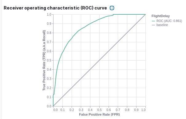
You can also generate these metrics with the data frame analytics evaluate API. For more information about interpreting the evaluation metrics, see 6. Evaluate and interpret the result.
API example
First, we want to know the training error that represents how well the model performed on the training data set.
POST _ml/data_frame/_evaluate
{
 "index": "model-flight-delays-classification",
   "query": {
    "term": {
      "ml.is_training": {
        "value": true
      }
    }
  },
 "evaluation": {
   "classification": {
     "actual_field": "FlightDelay",
     "predicted_field": "ml.FlightDelay_prediction",
     "metrics": {
       "multiclass_confusion_matrix" : {}
     }
   }
 }
}
Next, we calculate the generalization error that represents how well the model performed on previously unseen data:
POST _ml/data_frame/_evaluate
{
 "index": "model-flight-delays-classification",
   "query": {
    "term": {
      "ml.is_training": {
        "value": false
      }
    }
  },
 "evaluation": {
   "classification": {
     "actual_field": "FlightDelay",
     "predicted_field": "ml.FlightDelay_prediction",
     "metrics": {
       "multiclass_confusion_matrix" : {}
     }
   }
 }
}
The returned confusion matrix shows us how many data points were classified
correctly (where the actual_class matches the predicted_class) and how many
were misclassified (actual_class does not match predicted_class):
{
  "classification" : {
    "multiclass_confusion_matrix" : {
      "confusion_matrix" : [
        {
          "actual_class" : "false",
          "actual_class_doc_count" : 8802,
          "predicted_classes" : [
            {
              "predicted_class" : "false",
              "count" : 7262
            },
            {
              "predicted_class" : "true",
              "count" : 1540
            }
          ],
          "other_predicted_class_doc_count" : 0
        },
        {
          "actual_class" : "true",
          "actual_class_doc_count" : 2952,
          "predicted_classes" : [
            {
              "predicted_class" : "false",
              "count" : 794
            },
            {
              "predicted_class" : "true",
              "count" : 2158
            }
          ],
          "other_predicted_class_doc_count" : 0
        }
      ],
      "other_actual_class_count" : 0
    }
  }
}
If you don’t want to keep the data frame analytics job, you can delete it in Kibana or by using the delete data frame analytics job API. When you delete data frame analytics jobs in Kibana, you have the option to also remove the destination indices and data views.
Further readings
edit- Classification analysis example (Jupyter notebook)
- Benchmarking binary classification results in Elastic machine learning
- Using Elastic supervised machine learning for binary classification
- Machine learning in cybersecurity – part 1: Training supervised models to detect DGA activity
- Machine learning in cybersecurity – part 2: Detecting DGA activity in network data
- Combining supervised and unsupervised machine learning for DGA detection
On this page
- Classification algorithms
- 1. Define the problem
- 2. Set up the environment
- 3. Prepare and transform data
- 4. Create a job
- 5. Start the job
- 6. Evaluate and interpret the result
- Multiclass confusion matrix
- Area under the curve of receiver operating characteristic (AUC ROC)
- Feature importance
class_probabilityclass_score- 7. Deploy the model
- Inference
- Inference processor
- Inference aggregation
- Performing classification analysis in the sample flight data set
- Preparing your data
- Creating a classification model
- Viewing classification results
- Evaluating classification results
- Further readings
ElasticON events are back!
Learn about the Elastic Search AI Platform from the experts at our live events.
Register now