Our accessibility journey: Mindset and tools
Two years ago, we published a post near the time that we were kicking off our accessibility work. Since then, we’ve come a long way in our understanding of what it means to build an accessible product and best practices for doing so. With 7.6, we’ve shipped quite a few accessibility improvements and fixes all over Kibana, and thought now would be a good time to highlight some of our recent work.
Introducing our accessibility statement
The goals for our accessibility efforts go beyond compliance: We want all humans to feel empowered to understand and effect the world when they use Elastic products. Not as focused on minutia as a traditional VPAT might be, we hope that by putting our accessibility work front-and-center in an easy-to-read format, we can show our commitment to building an inclusive product for everyone. You can find our statement under Accessibility in the Kibana docs. (If you are interested in our formal VPAT, please message accessibility@elastic.co.)
Recent highlights
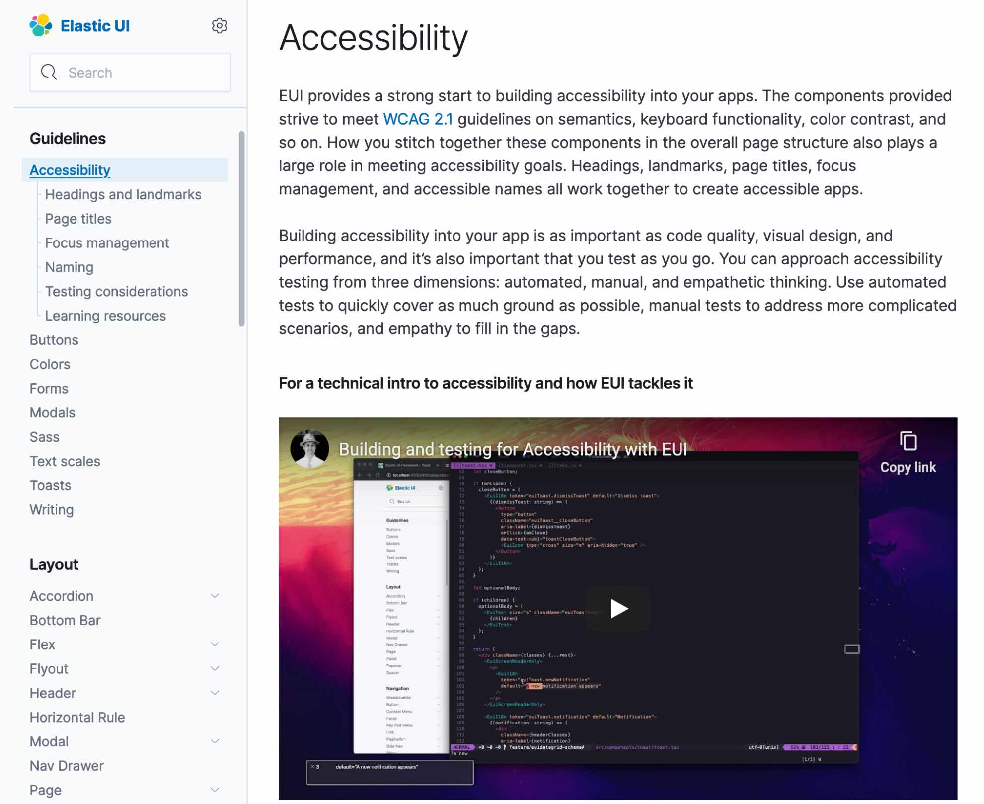
An accessible EUI
EUI, or Elastic UI, is the component library that’s behind all of the UI that we create at Elastic. An accessibility focus at this foundational layer of our work ensures solid building blocks supporting every piece of UI we create. By consolidating all of our most used patterns in one area, we’re able to provide consistent experiences and handle lots of accessibility concerns before the scores of implementing developers — from Kibana, to Elastic Cloud, to every other UI team, internal and external — even get to work. We still have a list of improvements we're looking to implement in EUI, but we’re quickly approaching a point where we’ve checked off all of the obvious boxes and can move on to improving Elastic-specific use cases.
To see some of the things we strive to instill in EUI and in our consuming app, take a look at our recently published Accessibility Guidelines or jump into EUI’s Github issue tracker to get involved with the details.

Navigating around Kibana
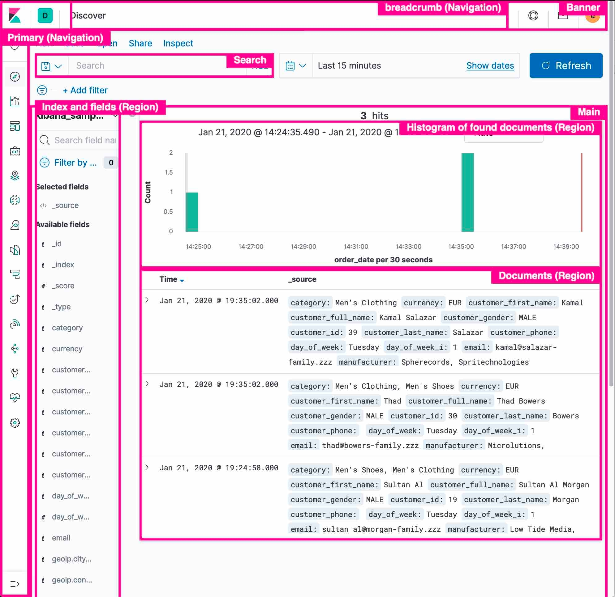
Kibana’s big. And loaded with features. And built by a huge, diverse, and growing team. So, sometimes, we can miss the little things that make a UI that’s quick and easy to navigate. With 7.6, we’ve gone back and updated all the products within Kibana with a more complete heading and landmark structure to make navigating with assistive tech that much easier.

Mindset shift
Years ago, we promised to continue improving our process around creating accessible experiences for everyone. Since then, we’ve been able to imbue many parts of our process with a larger accessibility focus:
- Members of our QA team have trained on how to use automated tools and screen readers to evaluate accessibility.
- Our design team is trained to think about accessibility up front, which means the design and UX is accessible from the ground up.
- Many PRs now start with accessibility already on the minds of implementing developers from our continued education efforts through Slack, team training, and engagement at company events.
- Accessibility specs for our more complicated components (e.g., EuiSuggest, EuiDataGrid).
But we’re most excited about our rollout of automated accessibility testing powered by axe. Automated testing can’t find every problem but it’s great at picking off that low-hanging fruit so that we can focus on the harder problems. Kibana is already up and running with several high-level tests and EUI has kicked off the process to follow suit.
Future work
There’s always more work to do but here are some things that we’ve got our sights set on for the immediate future.
An accessible Charts library
As Elastic Charts grows to become the future of all charting around Elastic, we recognize that it needs to work for all of our users. We’ve been talking about the best ways we can support sighted and vision-impaired screen reader users and have some concrete ways we plan to improve. This won’t be a one-and-done sort of effort, so we encourage you to monitor our progress at elastic-charts#300 and get involved.
Better navigation
Navigating between pages in SPAs has always been a little more difficult for screen reader users than traditional websites have been. We have a big redesign coming together for how to improve our navigation for everyone and are expressly tracking some of the high-level accessibility issues that we plan on tackling at the same time.
How you can help
Accessibility is a critical part of the user experience. If you'd like to help us make our interfaces more accessible, you can browse EUI's or Kibana’s accessibility issues to find areas that need improvement. If you find a part of our UI that's inaccessible to you, please file an issue or email so we can work together to find a solution.