So iconic: A story about a team, a dream, and a visual hierarchy
Did you notice we redesigned our product logos and icons a while ago?
No? Good. Because this is not another tech rebrand. Or a big unveiling.
Instead, it’s an iterative redesign to create a foundation. A design system as opposed to an aesthetic facelift. (Yay!) A collaborative process, not a switch the design team just felt like flipping. And maybe most importantly, a learning experience on how to unify tech and marketing. So here’s the deal: We’re a growing design organization supporting super smart engineers.
We create a lot of content. And that’s provided us with insights we’d be selfish not to share.
So how do you support a multi-product, fast-developing, highly-distributed tech company with scalable design? How do you do it when your organization is an ever-growing machine built with a diverse set of parts, evolving at an accelerated rate?
The answers are nonlinear and not so obvious.
Perspective
Hey, I’m Jess and I’m a visual designer. Before joining Elastic, I worked for Swiftype, a smaller scale operation. We’re talking about a 30+ person startup located in San Francisco with a 2-person design team. And that means all of the ownership a designer could ask for, from product design to web design to brand illustration to presentation decks (ok some of it we didn’t really ask for). We also sat 10 feet away from our engineers. Our approval process: Short. The stakeholders: Minimal. The direction: Clear.
It was then that we were invited to join Elastic, a sizable multi-product, distributed company, and what I would soon find out was a giant caring group of super smart people from around the world that take a lot of pride in what they do.
So what did this have to do with redesigning logos? Patience, my friend, we’ll get there.
When news broke that Elastic and Swiftype would join forces, I booked it straight to their website. Did I look up potential to IPO? Growth rate? Top notch employee testimonials? Of course not! I’m a designer! I needed to check out the branding. Give me that color palette and those icons, illustrations, fonts, padding, margins, and dashboards. That’s normal, right?
But, an under-researched, slightly premature first attempt sparked the conversation and planted the seed for a reorganization and refresh.
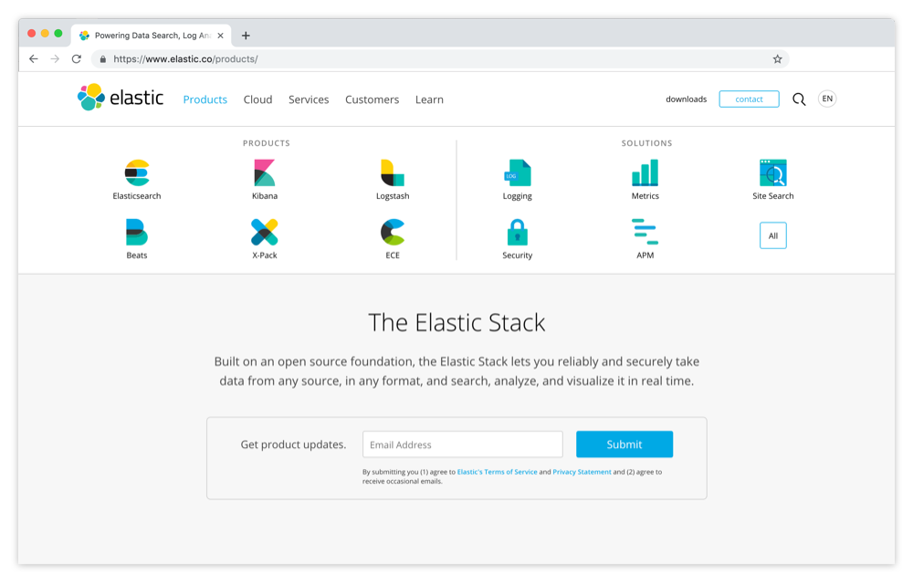
What did I find? Elastic.co put all of the solutions and products front and center, no drop downs, no hiding places, displaying the logos (and some icons) of the products and solutions at the top of the page. I noticed that they were all pretty different but presented at the same level. The designs weren’t bad, just inconsistent. Some had letter marks of vibrant colored overlapping shapes and some had low contrast color blocks, some were word plays and metaphors and, some were iconographic representations of their functions. Some had two colors, some had three colors (maybe they were cousins, but definitely not siblings). Some were logos, some were icons, some were logicons (I made that last one up).
So what comforted me? When I first met with my new design team, they brought these things up and they already knew. Yes, this was a thing. THEY KNEW! YAY! And they wanted consistency just as much as me.
Growing pains
Our original product logos and iconography were well-thought-out conceptually. And at a point in time, the system worked. But with the rapid growth of the company the rules got muddy and the system needed an update. (Our company had doubled in size in a year and a half, and with acquisitions and internal innovations, we were developing new products and apps by what seemed like the second.)
We knew we needed to act. This was the intersection of brand and product. And it was important.
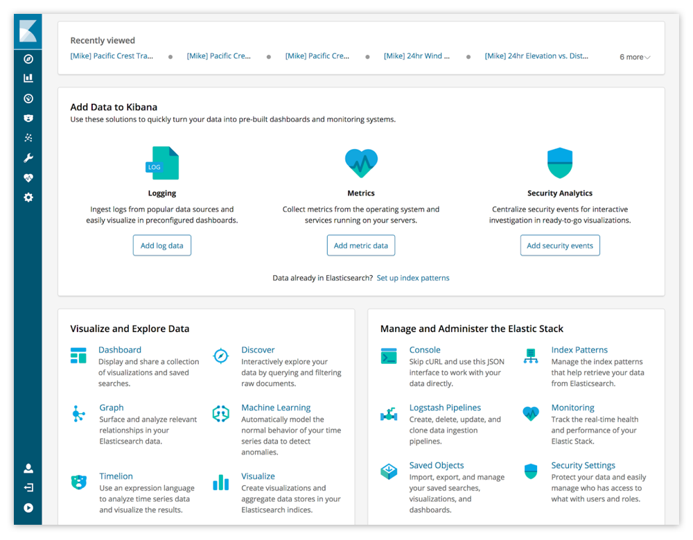
These product logos and icons were not just marketing gimmicks, they were important parts of our dashboard/UI that users interact with every day. They needed to be clear as relevant marks to apps and plugins (engineering), as well as being aesthetically sound and follow a stronger branding formula (marketing).
Diving in
So the first attempt to fix this was based purely on aesthetics — classic designer move, am I right? From a visual design perspective, some of the objects represented just weren’t working. So we traded locks for shields, pie charts for line graphs, documents for browser windows, and so on and so on because they were basically the same right? Pfft no, definitely not. Turns out these concepts were well-thought-out collaborations that made sense. It was clear that we could have done more research. But, an under-researched, slightly premature first attempt sparked the conversation and planted the seed for a reorganization and refresh.
![]()
Fast forward a couple of months, when I was in the thick of it and my training wheels were ripped off of my Elastic-branded bike (this is a metaphor but I’m not ruling out the fact that this might exist soon). I witnessed the requests flooding into our Github design repo… and they were assigned to me! I was getting my research, yay! But it didn’t feel very “yay!” at the time.
Elastic is a company built on open source principals, meaning everyone has a voice (and explains why the Design team uses Github for task management). This also means there is very little barrier between an engineer with an idea and a designer. And requests were pouring in because there were multiple contributors coming to the conclusion that they would need an icon or logo to represent the newest app, or plugin, or product, or solution. But all the requests had different owners with different understandings of branding and logo or iconographic marks. There were requests for “logos” that maybe could be “icons” that were needed for product dashboards and navigation, but that could also (maybe) be used on the marketing site, and (obviously) in diagrams and on stickers, and (possibly) as a glyph.
We obviously needed a system, but where to start?
Icon vs logo
Our first step was educating our engineering friends on the importance of visual hierarchy. What is an icon and what is a logo? As designers, that’s part of our DNA, but we sometimes forget that it usually needs to be communicated.
Ok this breakdown is debatable but this is what has worked for us so I’m sticking to it:
Icons are marks that show functionality. They’re visually obvious even without a text label, whether it’s a culturally accepted visual representation (ie - download icon) or an obvious depiction of something (ie - support = a person with headphones). Icons usually come in sets. And the icons within the set share basic visual rules and guidelines that create cohesion. When a user sees an icon it is assumed that the user is past the point of needing brand recognition (because they are already inside of the brand), and that is why we trade style and strength of a logo for generic representation of functionality.
Logos can be more abstract, with more emphasis on a strong visual mark that is memorable and relies on repetition and visual prominence. Logos often times are one-offs, outside of a family. But in the case of a multi-product company like Elastic, there are several logos, so they need an underlying rule to keep them cohesive and recognizable as part of the umbrella brand. Logos don't need to be visual analogies and recognizable characters. They can be fully abstract. Empty containers, filled with meaning and brand association over time.
Our main brand and logo is called the “cluster,” but there are so many strong products under this main brand that need hierarchy. And whether something gets a logo or an icon tells us where it falls in that hierarchy.
When a user sees an icon it is assumed that the user is past the point of needing brand recognition
The toughest concept to teach engineering friends is the importance of visual strength and brand cohesion and how that outweighs the need to capture every single function of an app in a tiny little mark. If we break our tech down into a hierarchy, we must be true to that hierarchy. If something is given the hierarchy of product and therefore needing a logo, then the distinctness of that logo is more important than the cliché functional representation of the tech.
Apps get logos, features of apps get icons — cash me outside on Twitter if you want to fight about it.
A chance to execute some iconography styles
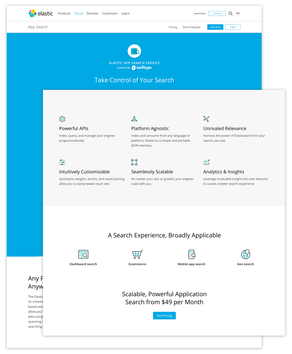
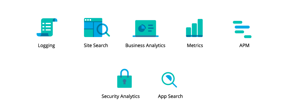
Surprise! The Product Team needed some new pages for new solutions and those pages needed iconography. So, these web pages became our testing grounds for visual direction. We all agreed that the current iconography process was not efficient and did not produce the best results. The colors vibrated, the negative space was inconsistent, aspect ratios were very different, the use of line, geometry, corner radius, and detail level needed some adjustment.
What did we consider while coming up with design options? Fast production, product side applications, sizing, easy execution, and clear rules. This was an opportunity to build a whole new set and we went for it, failing fast but remaining unflappable.
Initially, the pendulum swung too far into the land of gestural brushstrokes. And then back to mechanical, easy to read, glyph-like marks. Finally, we naturally settled in a place that worked for us:
Exploration example:
![]()
This is where we landed:
![]()
Hierarchy, what is it?
Flashback to the acquisition — I was excited to be a part of Elastic, but of course, I was afraid of the inevitable, losing our identity. Swiftype had just finished a brand refresh with a new color palette, updated fonts, an illustrative style I could lose myself in — clean iconography and beautiful gradients! And now what? Were we just going to become an icon on the side of a dashboard? I know, don’t get emotionally attached, but I couldn’t help it. I can only assume this feeling is shared with other companies during acquisitions.
We hung out with the brand, met the family, saw it laugh, saw it cry...
More fast forwarding (oh, I’m sorry, do you have whiplash yet?) — later on, it was decided that Swiftype’s products would fall into a category that we called “solutions” and would be treated with the branding hierarchy equal to a product. This made sense, as the Swiftype solutions introduced SaaS offerings and could benefit from being packaged with a higher level of branding. These solutions came with their own dashboard, branding, and customers. While the Swiftype logo would be retired, we had the opportunity for new branding.
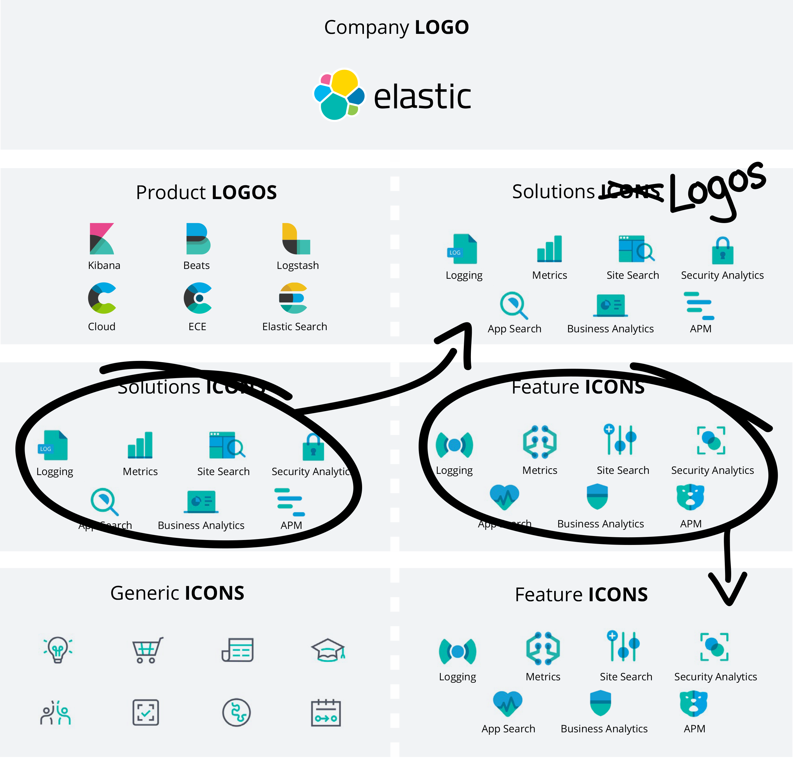
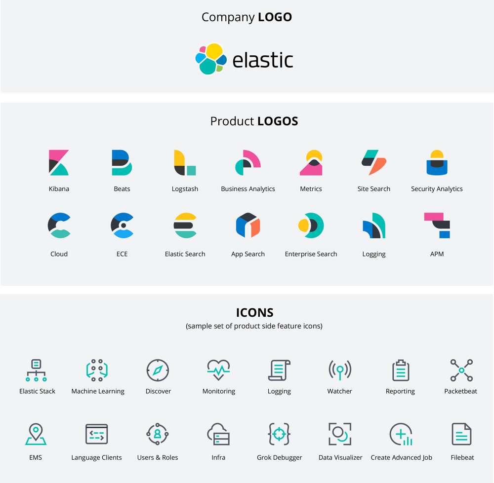
After we had established an icon style we were able to create a map both our current visual hierarchy and our aspirational hierarchy. We made our Solutions visual hierarchy equal to our logos and the features would become generic icons. Now we just had to establish and be confident in what our logo style was.
Hierarchy then:
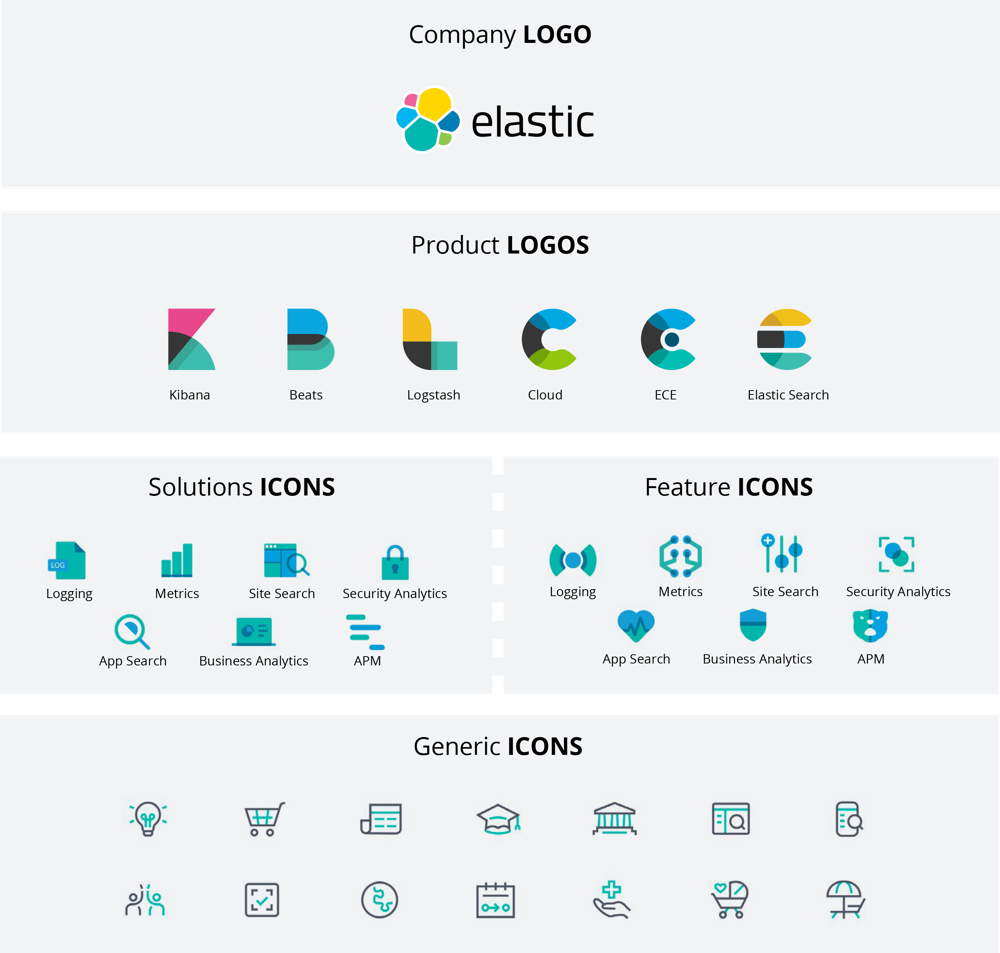
Hierarchy aspirations:
Our Logos
Our current logos had some history, and we weren’t ready to throw them in the garbage can, but they needed work, so we gave them some love. It’s amazing what consistency in color and negative space can do.
Here’s what we started with:
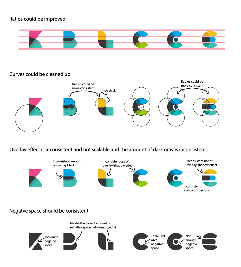
And here’s what we did to adjust:
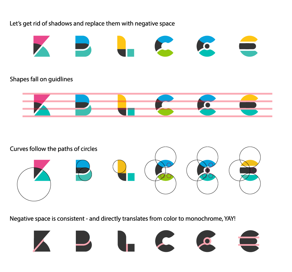
Wait for it:
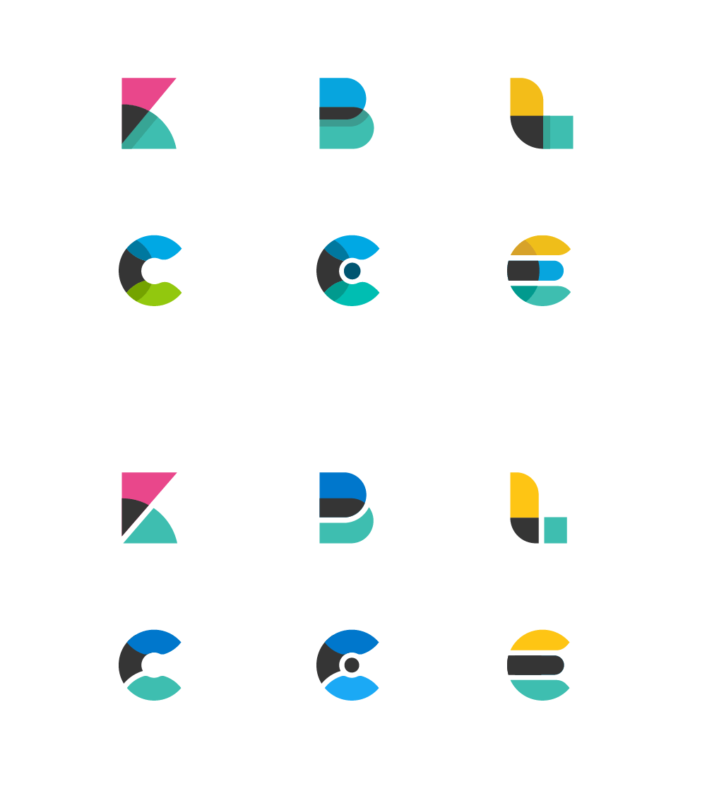
Once we figured out the design formula of the established products, we could move on to designing the newly graduated solutions.
This is what we came up with as a rule:
- Inspiration comes from data visualizations
- Two simple geometric shapes overlapping to reference a third
- Two color main shapes plus dark cool gray overlap
- Consistent negative space between dark cool gray shape and color shape where they separate
- Overlapping shapes consist of both straight and curved lines
- On a pixel grid with consistent negative space depending on size application
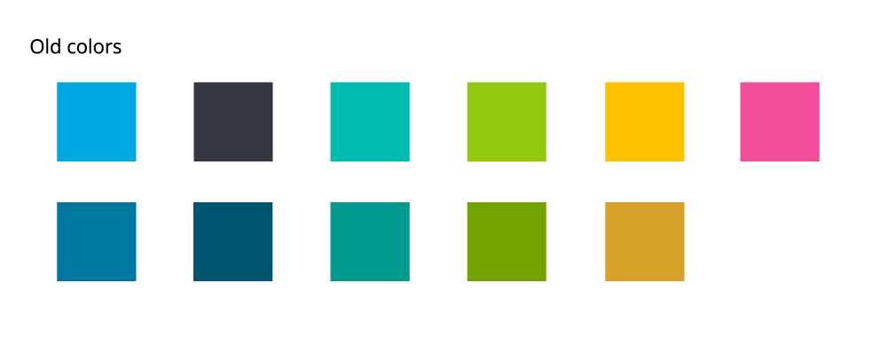
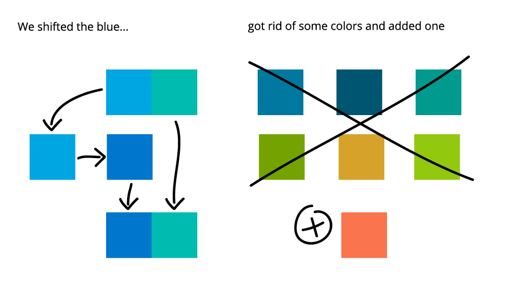
As mentioned previously, our main colors didn’t like each other. Elastic blue and Elastic teal were not friends. And this was most obvious in our solutions logos:
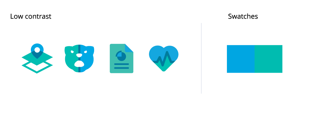
We didn’t want to send our complete color scheme down the garbage disposal, and we found that we didn’t have to. We shifted the blue and added a red(ish), and pow, Elastic was looking so fresh:
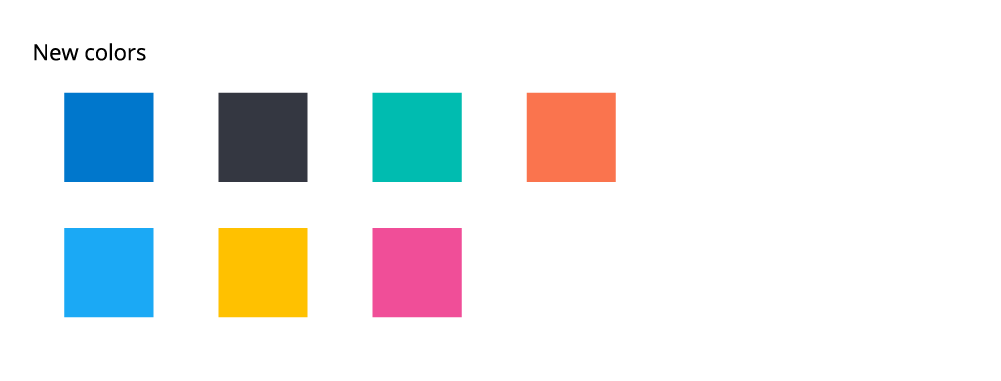
Updated Product logos with color update:

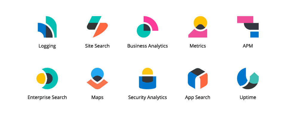
The solutions logos we came up with (with some recent additions — I told ya we constantly evolve and grow):
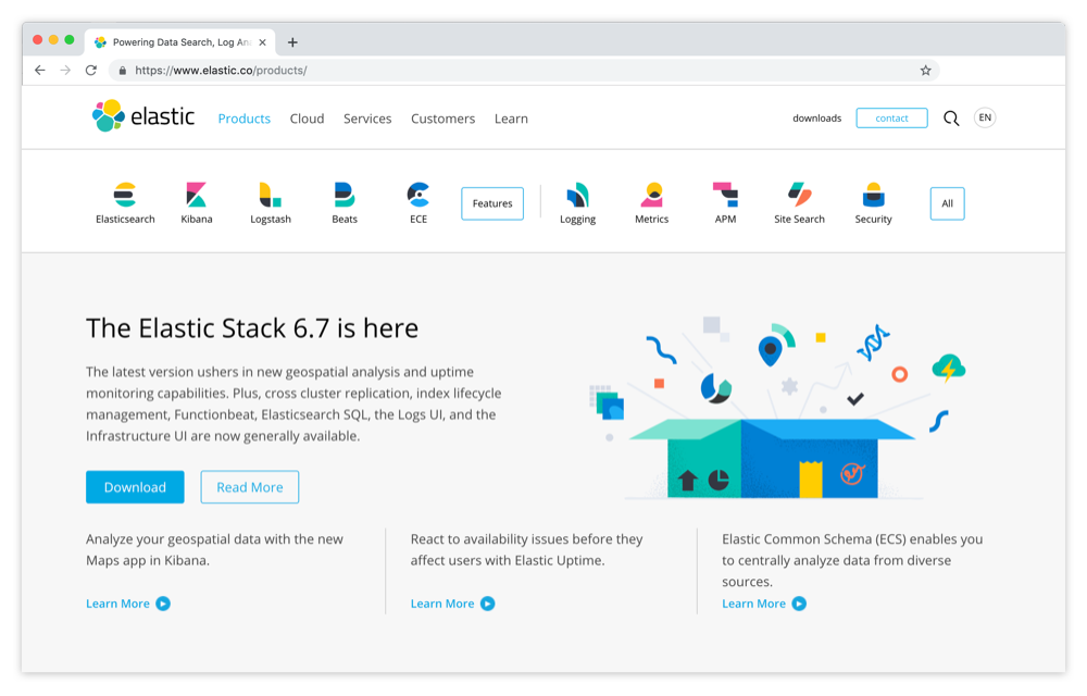
And full circle, here is how our products and solutions are presented on the site:
And we reached our hierarchy goal. Achievement unlocked!
Conclusion time
Elastic is built on open source and iterative notions, it’s part of Our Source Code: progress, simple perfection. We are fluid and flexible and light-hearted. We aren’t afraid to try things and fail. This is just a piece of a machine that will keep improving and set itself up for growth until it doesn't make sense anymore. And when it doesn’t make sense anymore, we’ll replace it with something better.
But for now, we have a system that works and allows us to think about what’s next.
No, we didn’t just push a button and launch a new brand. We hung out with the brand, met the family, saw it laugh, saw it cry (I am very good at metaphors) and then we acted on what we felt was best.
Now, we don’t have a template or a formula from a textbook. We have real-life, fast-moving solutions we’re familiar with and proud of.
If you are interested in more from the Elastic Design team, follow us on Dribbble. And if all of this design talk gets you pumped 💪, check out our current job openings in Design.