Threat Map
| Version | 1.1.0 (View all) |
| Subscription level What's this? |
Basic |
| Developed by What's this? |
Elastic |
| Minimum Kibana version(s) | 9.0.0 8.14.0 |
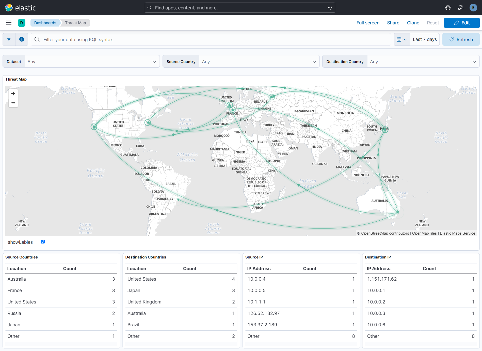
The Threat Map dashboard visualizes network traffic flow between regions using directed paths and animations. It includes arrows indicating direction and pulsing arcs at the destination.
The animations may increase browser CPU usage.
To use the Threat Map dashboard, make sure you have the following:
- Timestamp Field: Documents must contain a
@timestampfield for time-range filtering. - GeoIP Processor: Apply a GeoIP processor to the IP field. The resulting document should contain
source.geoanddestination.geofields.Here is an example of an ingest pipeline that adds the geographical information to the
geofield based on theipfield.PUT _ingest/pipeline/geoip { "description" : "Add ip geolocation info", "processors" : [ { "geoip" : { "field" : "source.ip", "target_field" : "source.geo" } }, { "geoip" : { "field" : "destination.ip", "target_field" : "destination.geo" } } ] }
- Data View: Use documents accessible via the
logs-*data view.
Data is retrieved from Elasticsearch using the _all,*:_all index search endpoint. Ensure the following fields exist in each document:
| Field | Description | Required/Optional | Default Value |
|---|---|---|---|
source.geo.location.lat |
Latitude of the source | Required | |
source.geo.location.lon |
Longitude of the source | Required | |
source.geo.country_name |
Country name of the source | Required | |
source.ip |
IP address of the source | Required | |
destination.geo.location.lat |
Latitude of the destination | Required | |
destination.geo.location.lon |
Longitude of the destination | Required | |
destination.geo.country_name |
Country name of the destination | Required | |
destination.ip |
IP address of the destination | Required | |
color |
Arc color | Optional | "#54B399" |
animate |
Determines if the arc is animated | Optional | true |
weight |
Arc line thickness | Optional | 1 |
source_label |
Label at the source location | Optional | |
destination_label |
Label at the destination location | Optional | |
pulse_at_source |
If true, the pulse begins at the source instead of the destination | Optional | false |
These fields can be added or modified using Custom pipeline. Read more.
The Threat Map visualization can be added to other dashboards in two ways:
- Click the Duplicate button in the top-right corner of the dashboard.
- A clone of the dashboard will be created for your customization.
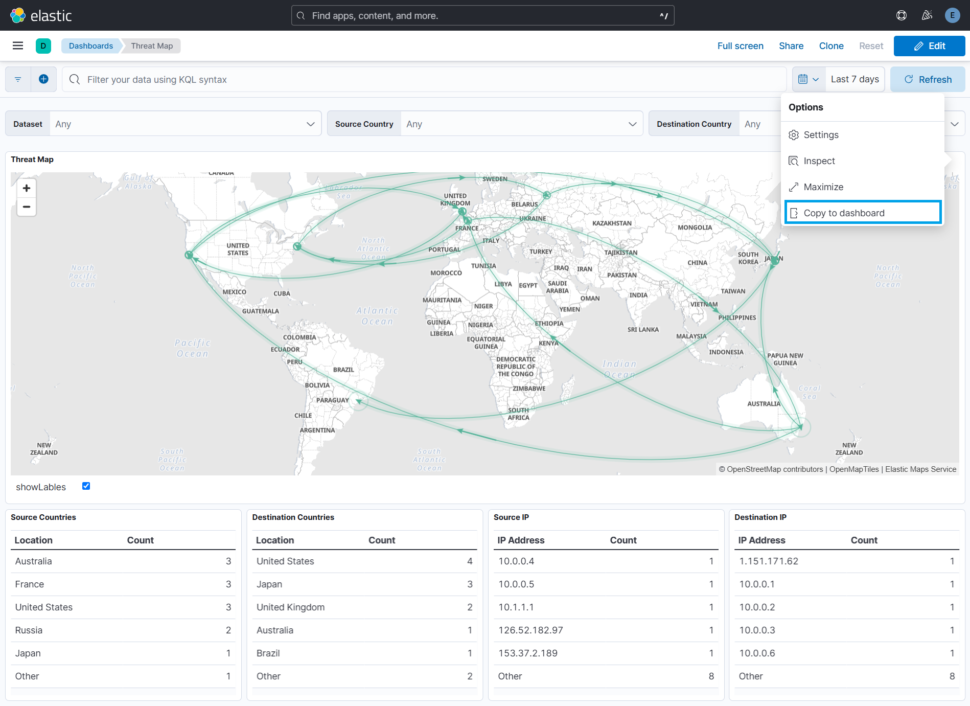
- Click the three dots in the top-right corner of the visualization and select Copy to Dashboard.
- Choose one of the following options:
- Existing Dashboard: Select an existing dashboard from the dropdown, then click Copy and Go to Dashboard.
- New Dashboard: Create a new dashboard with the visualization.
The Threat Map dashboard includes the following visualizations:
- Framework: Utilizes Vega within Kibana.
- Fields Used:
source.geo.location,destination.geo.location,color,animate,weight,source_label, anddestination_label. - Customization:
- Click the three dots in the top-right corner and select Maximize to enlarge.
- The map adapts to Kibana's dark/light mode automatically. Read more.
Includes four tables for analyzing traffic flow:
- Source/Destination Countries: Shows the top 5 countries with the highest traffic flow.
- Source/Destination IPs: Shows the top 5 IPs with the highest traffic flow.
Data in panels can be sorted by clicking on the Count column header.
- Use KQL (Kibana Query Language) in the query bar at the top of the dashboard.
- Adjust the time range using the selector in the top-right corner (default: last 30 minutes).
- Maximum records displayed: 10,000.
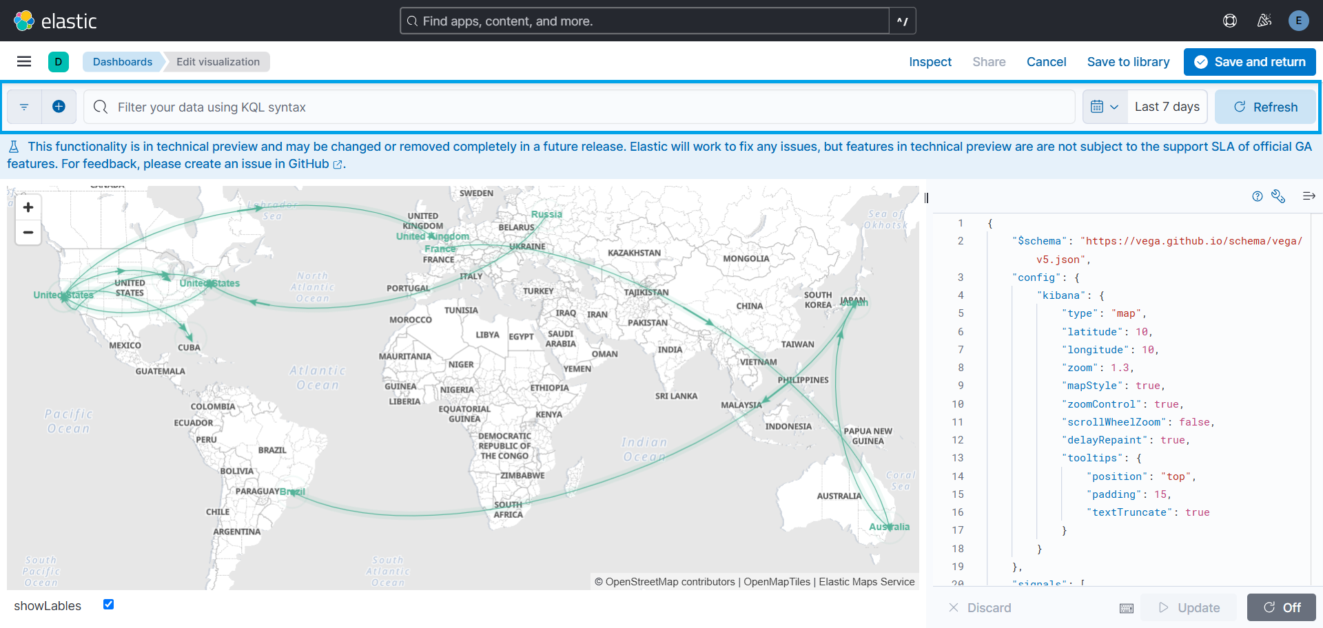
- Click the three dots in the top-right corner of the map and select Edit Visualization.
- Apply a filter using the query bar.
- Click Save and Return to apply changes.
The following options are available for customization:
| Option | Description | Default Value |
|---|---|---|
emsTileServiceId |
Sets the EMS-layer for the map. | "undefined" |
Latitude |
Starting latitude of the map | 10 |
Longitude |
Starting longitude of the map | 0 |
Zoom |
Starting zoom level of the map | 1.3 |
scrollWheelZoom |
If true, disables mouse wheel zoom to avoid accidental zooming | falses |
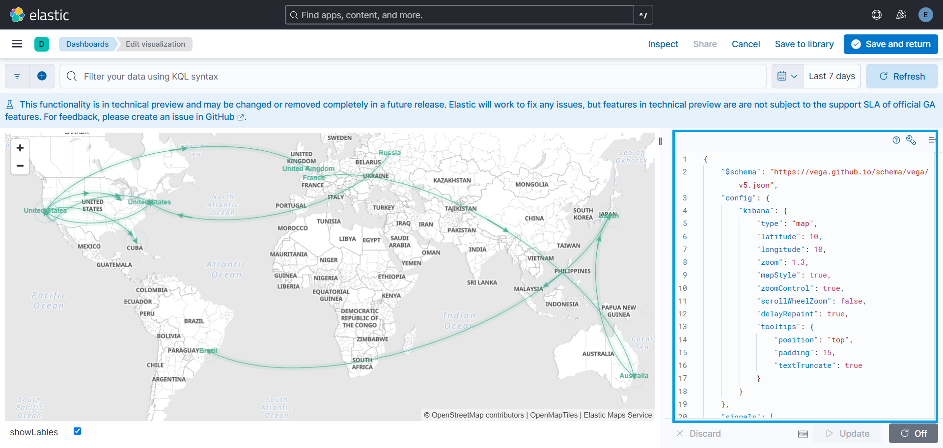
To customize these options, click on Edit visualization from the dropdown in the top right corner of the visualization. A Vega editor will open, where you can modify the following configurations.
For additional customization options, see the Vega Kibana Guide.
This integration includes one or more Kibana dashboards that visualizes the data collected by the integration. The screenshots below illustrate how the ingested data is displayed.
Changelog
| Version | Details | Minimum Kibana version |
|---|---|---|
| 1.1.0 | Enhancement (View pull request) Improve documentation |
9.0.0 8.14.0 |
| 1.0.0 | Enhancement (View pull request) Release package as GA. |
9.0.0 8.14.0 |
| 0.2.1 | Bug fix (View pull request) Remove unnecessary policy definition in manifest. |
9.0.0 8.14.0 |
| 0.2.0 | Enhancement (View pull request) Update Kibana constraint to support 9.0.0. |
9.0.0 8.14.0 |
| 0.1.2 | Bug fix (View pull request) Fix the Invalid SVG path error caused by the geo_point type for source and destination geolocation fields. |
8.14.0 |
| 0.1.1 | Bug fix (View pull request) Fix the DSL query to fetch only the fields used in the threat map visualization. |
8.14.0 |
| 0.1.0 | Enhancement (View pull request) Initial draft of the package |
8.14.0 |


